Obviously, the thing that makes the most sense for a NYC-inspired region is a gang of radicalists who dress like knights. Aside from the random stitching on the hood, these are solid designs. Except, are they seriously supposed to be chainmail? If so, then cool! But why the hell are they wearing chainmail? If not, then that makes even less sense. I can understand not dressing like thugs, because they consider themselves "justice". But why knights? They didn't have a "Knights of the Round" theme going on at all, that could've been kinda cool. Anyway, my complaints are mainly about the appropriateness of the design, not the design itself. It's a decent look for low-level Paladin NPCs in some video game that isn't Pokemon.
Grunts: 8/10

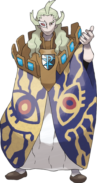
There are no admins, just some old sages who don't really matter until BW2, so it's just Ghetsis running the show. And I think he's supposed to be dressed like a king, but holy shit why does he have an entire castle parapet on his shoulders? And what's with the gigantic eyes? and the scouter? Dude looks like he came straight outta Nausicaa. It's a weird, funky design, and feels "pagan" in a neat sort of way. I actually don't hate it, but I question it fitting in this environment. It also feels like it has very little to do with the Medieval theme that's been "established" - it's just too weird, for how by-the-book the Grunts are.
Ghetsis: 5/10
Then we have N, who really serves as your rival in this game. You also have Cheren and Bianca and Hilbert/Hilda running around, but since none of them are actually opposed to you at all, there's no tension. N conflicts with the player on an ideological level - you wanna catch 'em all, he wants to set 'em all free. The manner in which his ideology was just sort of hand-waved away, despite him being able to literally talk to Pokemon, was a main failing of the game's plot.
But let's talk design. He's cool! I'm saying this about everybody here, but they're all fairly alright designs - they just feel like they come from three completely different games, much less the same goddamn organization. Did N not get the memo? At least Ghetsis made some shit with paper-mache and stuff, N just walked out with his casual clothes on. I dig the style, big fan of Terry Bogard-style hats, light-green and monochrome make a cool visual look. but jesus what is he doing looking like this and being "the King" of Team Plasma. He looks confident but relaxed, and would have made a great proper Rival, maybe the best since Gary Oak.
n = x/10, when x = 9

So yeah, Team Plasma is stupid and couldn't decide on a theme. Why are they a "team" anyway, shouldn't they be a Cult? or a Kingdom? or an Order? And why "Plasma" of all things? None of it makes any sense. Their motivation seems promising at first, but then it's quickly revealed that N is maybe the only person in the entire group who genuinely believes in their cause. The rest are just going along with Ghetsis to steal Pokemon. And I still don't get N - he can talk to Pokemon, and heard from them about how awful people are, and how they want to be free, right? So why does all that get brushed under the rug? Just because you the Player are a good trainer, doesn't mean everybody else in the entire world is. Maybe there ARE some Pokemon who don't want to live and breed for the purpose of fighting. But the way the story goes, it paints N as just being flat-out wrong - Pokemon actually love this shit. It's like they called up Michael Vick's dogs at his trail as witnesses, and the dogs admitted they actually are totally into fighting each other.
I mean, for the sake of the series, the Player has to be the moral one. You can't admit that PETA was right all along. I just feel like, despite intended to introduce some morally grey subjects, the end result was very (wait for it) Black and White.
To wrap it up, "Team Plasma" fails at everything, from name, to organization, to goals, to cohesive costume design.
Overall: 1/10

