Sunday, April 29, 2012

No. 426: Drifblim

Any Led Zeppelin fans in the house?


well, too fricken bad. Because this guy here is a hot air balloon. If he had a third evolution, it would definitely be a zeppelin, though. That would be badass.

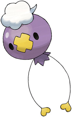
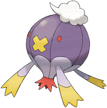
So, Drifblim has that silly little whipped cream topping, the yellow cross, and some dangling arms with yellow tips. That's nice continuity. But I don't like the red bits. I'm guessing they wanted the red at the bottom to represent the fire that heats the balloon, but it's pointed the other way, right? doesn't it look like it would be shooting down?

again, it seems like adding new colors into a perfectly acceptable mix is just a bad idea. A little dangling basket, like an unhinged lower jaw, that would've been great.


Overall: 5/10

Friday, April 27, 2012

No. 425: Drifloon

Neunundneunzig Luftballons

Balloons aren't normally scary, so Gamefreak did their best to make this Ghost/Flying at least a little strange, but someone they also made it look ridiculous instead. The little puff of whipped cream on top is a good example. I know it's supposed to be a cloud, but... no way am I not gonna look at that and not think "that is whipped cream".

then there's a yellow cross on the from, possibly intended to be like a patch? and the hands are little hearts. I don't know you guys, it all seems a little random. Like, they drew a balloon with eyes and little string hands, then realized even they couldn't pass that off as a decent Pokemon, so threw some more things at it and made up some bullshit about how it tricks children into grabbing it's hands and then flies off, abducting them.

I do like how you can only catch them on Fridays, though, as they drift through the area. That's a nice touch. I wish they did more things like that, or made more use of the day/night mechanic.


Overall: 3/10

Thursday, April 26, 2012

No. 424: Ambipom

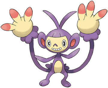
why are his fingers red WHY ARE HIS FINGERS RED


ooh lordy lord, I do not like this one, not one bit. Aipom made me uncomfortable, with his face and prehensile tail hand, and Ambipom is doing nothing but increasing the creep factor. We are stepping outside my comfort zone, and I would ask to hold someone's hand, except Ambipom has too many as it is.

Speaking of which, look at those monstrous mockeries of hands. Three identical fingers, fleshy and bloated. The finger tips are red, because you know how Gamefreak is when they see something WITHOUT a random splash of unneeded color on it.

I think the thing that's getting me the most, though, is his face. Just - just everything about his face. That isn't the face of a playful monkey, or a mischievous little bugger. That is the face of a being that uses its hands to probe into places that shouldn't be touched, whether you like it or not. Especially if you don't like it.

Finally, what sort of monkey has a bowl cut?! I shudder to think of the implications. I can't even rate this guy, I'm just so disquieted. I feel like I need to check under my bed, lock my door, and turn on all the lights in the house.


Creep Factor: 10/10

Wednesday, April 25, 2012

No. 423: Gastrodon

No one's slick like Gastrodon, no one's quick like Gastrodon, no one's neck is incredibly thick like Gastrodon...


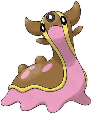
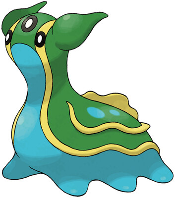
Oddly enough, these guys don't have as many flanges and flaps and protrusions as I would expect. They make up for it with three eyes, though, which is acceptably weird.

But I still like them. Sea Slugs are neato bandito, and both Gastrodons have pleasing color schemes. The pink and brown one reminds me of Neapolitan ice cream, a little. East-side remains beast-side. I almost have an issue with them being Water/Ground, instead of a much more sensible Water/Poison, but Water/Ground is such a nice combo I don't really care.


Overall: 7/10

Tuesday, April 24, 2012

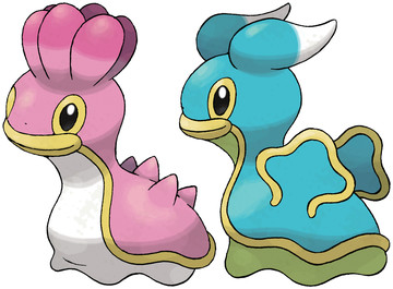
No. 422: Shellos

Now this guy has two forms, and I want y'all to take a look at both of them.


This was a good idea on Gamefreak's part. They had two good designs for a sea slug Pokemon, and instead of making two separate, virtually identical Pokes (like Minum/Plusle, Volbeat/Illumise), they made a single one that has a color variant depending on if you find on on the Eastern side of the mountains (pink) or the Western side (blue). There's a joke in here somewhere about East-end boys and West-end girls, but you'll have to find it yourself.

I think both these guys are great, and I think their lips are a nice touch. I especially like the fleshy whatevers on the pink one's head, and if it could have wings like the blue one, that would be perfect. But either neon color is fine with me. I guess I'd pick the pink one if I had to choose.


Overall: 7/10

Sunday, April 22, 2012

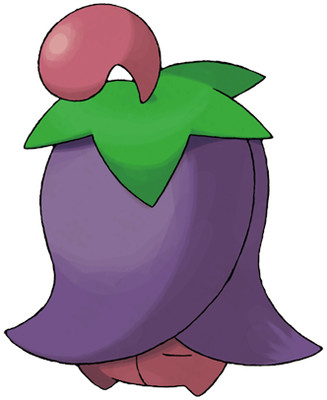
No. 421: Cherrim

aww, look who's shy!


What's that? You want to see Cherrim as an actual blossom, not some stupid cloaked whatever? Well, tuff stuff, because Cherrim only shows its face when the sunlight is strong. And the only reason a Grass Type would want the sunlight strong would be to throw out Solarbeams, but it also makes them in serious danger from a Fire Type.

So guess what, you won't be seeing Cherrim in it's blossom form much at all. Let me tell you, you ain't missing much, but still. It's infuriating. Why are there all these arbitrary, shitty gimmicks going on for shitty pokemon? Christ, I don't want to have to even use Cherrim, much less develop a strategy around getting the little tease to show some skin.

Cherrim doesn't have anything to flaunt, so it hides it instead. Well, screw that, Cherrim. I don't even care.


Overall: 1/10

Friday, April 20, 2012

No. 420: Cherubi

4/20 ON 4/20 SMOKE WEED ERRDAY


Now, you can't see my face, but I am making such a face right now. It is a face that says "what the actual shit is this, this is a goddamn cherry isn't it, who thought this was a good idea for a Pokemon".

If I were making a cherry pokemon, I'd tie it into slot-machines some how. Or maybe I'd go for the cherry blossom route, and plan ahead, so that its evolution could have a majestic sakura tree growing out of its head, to drop some mad Japanese language bombs.

But it would never, in my lamest dreams, occur to me to make it an actual cherry, with a tiny little siamese-twin cherry head along for the ride. Which looks stoned out of its goddamn MIND, by the way.


Overall: 2/10

Thursday, April 19, 2012

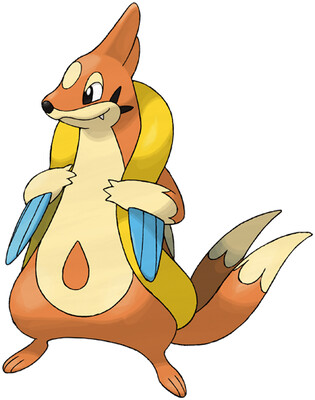
No. 419: Floatzel

okay, so blogger changed its format for creating new posts. I know that doesn't affect any of you, but I am hell of disoriented over here.

Floatzel is a bigger, badder Buizel, but he isn't better. First, that bellybutton tear-drop-shaped spot is distracting, for me. Then, one has to wonder what the hell sort of flotation device he's using. It looks almost like a raft, except only the outer rim? Or is it a floppy inner tube, that he's got entwined with himself? In either case, it doesn't read as well as what Buizel had going on. And still, no water wings.

Also, his tails look pretty much the same, which is odd, since they were one of Buizel's defining traits, you'd think they would at least get bigger. Or maybe three of them, like tri-blade propeller?

And in general, Floatzel is trying to make "weasel in an inner tube" look badass, which is just the wrong way to go about it. Ain't nothing badass about a rodent that can't swim on its own.


Overall: 5/10

Wednesday, April 18, 2012

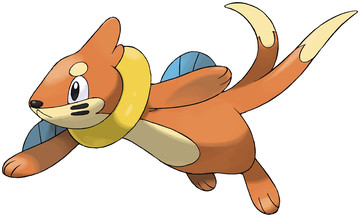
No. 418: Buizel

I don't like Miles "Tails" Prower because Tails is a fruitcake to the max. And also his name is ridiculous.

The idea of a weasel that swims around with waterwings and an inner tube around its neck just makes me smile. And then having two tails, that he spins like propellers... that's genius.

I don't know if I like that the "wings" appear to be blue fins, coming out of his arms, though. I think it would be better if he just had more yellow floaties on there. But besides that, Buizel is alright. He's a cool little critter, and while he may have a boring typing, at least he isn't just another generic fish.


Overall: 8/10

Tuesday, April 17, 2012

No. 417: Pachirisu

Pachi = electrical crackling sounds, Risu - squirrel. I got this.

I can tell they really want to make Pikachu again. But, the thing is, Pikachu already exists, and he's great. He also evolves into a somewhat usable Pokemon, which is more than I can say for Pachirisu.

I do like the color scheme, using electric blue and white, but then the yellow cheeks... just make it so damn obvious they wish it was the new Pikachu. I mean, it's cute, sure, but holy shits, you guys, just let it rest. You won't ever get that lucky and accidentally spawn a character who's universal recognition rivals Mickey Mouse again.


Overall: 6/10

Monday, April 16, 2012

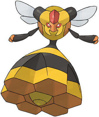
No. 416: Vespiquen

she's got one well of a wasp waist, I'll tell ya that.

There's already a "bee" Pokemon in Beedrill, but I think Combee and Vespiquen take the concept in different and interesting directions, playing off of the honeycomb concept, and the "queen bee" idea.

Vespiquen can only be obtained if your Combee is a female, which makes sense, because male bees are just lazy assholes; the females are the ones who do all the work. And as it was pointed out to me, female Combee are marked with that red triangle, which then becomes the red jewel crest on Vespiquen's head. So, I guess it does have a purpose, and works to bring out her eyes.

Also, Vespiquen has like three unique attacks, where she orders her swarm to heal her, defend her, or swarm the enemy. I like it, that's awesome, and it's a pity no other Bugs get to use some of the moves.


Overall: 9/10

Sunday, April 15, 2012

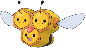
No. 415: Combee

Maybe I spoke too soon, Gamefreak.

Because this shit it delicious. A bee that is three honeycombs stacked together, it makes no goddamn sense, yet I love it.

Sucks that the typing isn't interesting, but I don't know what it would really be, besides Bug/Flying. And the shitty shit stats don't help, either.

Also, I take small offense to the random-ass red mark right there in the middle. It didn't need to be there, and I know Vespiqueen has one on her forehead, but that didn't need to be there, either.

So I guess it isn't as good as my initial reaction, but it's several damn sights better than the schlock I've had to put up with recently.


Overall: 7/10

Saturday, April 14, 2012

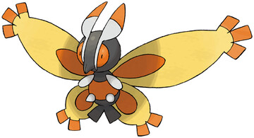
No. 414: Mothim

Look, Gamefreak, we need to talk.

Did you have any idea what you were doing when you made the Fourth Generation? Because, I don't think you really had enough ideas to justify an entirely new generation, here.

I mean, just look at this shit, Gamefreak. No, look at it, don't turn away. It's a fucking moth. again. It isn't special in any way, there's no reason to use it, or want it. It doesn't even have it's own evolutionary line, it was just horseshoed into the already terrible Burmy line. The definition of a filler Pokemon. And this isn't the first time, either. There's been a noticeable lack of inspiration going on here.

I mean, you did good on the starters, and the Luxray line is brilliant, but I think you should look at your life, and look at your choices. Because right now, you're looking like you're trying to prove everything the haters say about post-gen-2 games true.


Overall: 1/10

Friday, April 13, 2012

No. 413: Wormadam

I don't even giveadamn, much less Wormadam

Again, three forms, but they are all awful. I think they have different typings, but honestly, I can't bring myself to give a single rat's shit about this Pokemon.

But wait, it gets even worse! Because, as I literally just learned, only the female Burmy becomes a Wormadam! The male becomes a Mothim!

This is hiedeously pointless, because no one with a sound mind would bother to raise TWO Burmy to get both the male and female evolutions, much less bother with the whole cloak-change bullshit. There's like two gimmicks shoved into one Pokemon, and I hate everything about it.


Overall: 1/10

Wednesday, April 11, 2012

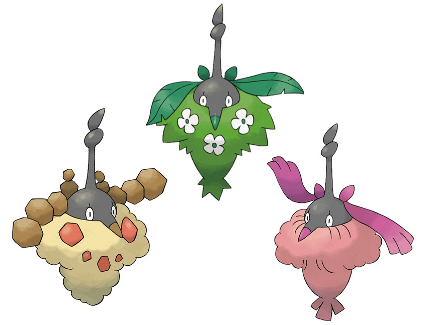
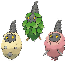
No. 412: Burmy

wat

seriously, wat.

What sort of thing is Burmy even supposed to be? Is it another stupid bagworm shit? Didn't Pineco cover that sort of thing? Was the frigging bagworm such an important thing that we needed to do it twice?

And if it's not a bagworm, then what in the hell is it? I know this is the pink version, and there's also a sandy orange one, and a leafy green one, but I don't care. Burmy is a horrible thing to look at and think about.


Overall: 1/10

Tuesday, April 10, 2012

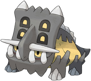
No. 411: Bastiodon

okay for most of this afternoon I thought it was Monday but don't judge me

You know where I've seen this color scheme before? Mawile! That doesn't really mean anything, but I guess dark grey/yellow is a good color combo for a Steel type.

Now, Bastiodon isn't quite a Triceratops, and I know that. I actually respect Gamefreak for not making all their fossil Pokemon the standard dinosaur fare, in fact, these two are the only technical "dinosaurs" in the lot. And even still, they're that headbutt dino and one of the many not-quite-triceratops.

But with all that said, I don't like Bastiodon, because he looks like a lout. Moreover, his face reminds me of one of the Thwomps from Super Mario World, but with a dumb shit-eating underbite on its face. Also, I don't like the spots on its frill, they feel like they're there just to take up space.

And besides, if I wanted a Rock/Steel juggernaut, I'd run Aggron. It's a fine concept, but that giant head just looks too derpy for me to ever want on my team.


Overall: 4/10

Monday, April 9, 2012

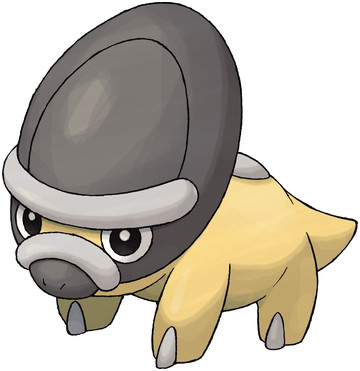
No. 410: Shieldon

This guy looks fake.

I mean, look at him. He's got only rounded edges, a predictably simple single toe per foot, those smooth ridges along his face like all the fakemon creators like to slap on their bastard creations, the design is just "well I guess his face is a shield?", plus the name is like the most illegitimate thing ever.

I mean, he's obviously not fake, and totally real, but I guess maybe he just looks so damn generic, that any old hack could've come up with him?

It's a weird feeling, but yeah, if I saw Shieldon as "WOW leaked 6th Gen Pokemon!!1" I would totally call it a faaaaaaaake.


Overall: 3/10

Sunday, April 8, 2012

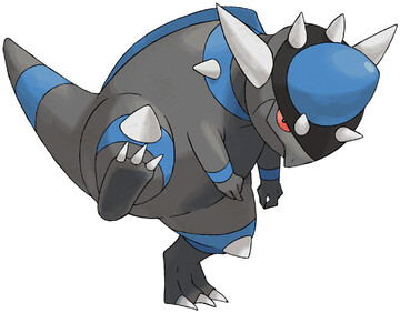
No. 409: Rampardos

There is an "Easter Egg" in this article, see if you can find it!!

Let's get the good stuff on the table first: Rampardos has 165 mother-loving base Attack, which is second only to Attack form Deoxys. That's pretty damn impressive. Then, he's got some nicely placed spikes on his body that add to the design and don't get in the way.

But on the other hand, he looks like he's got half his head missing! Look at him! They cut off half his head, and then put half a plastic Easter Egg on their, with some more spikes! I can't take a guy who wears an easter egg for a cranium seriously.

And then I want to point out the bands on his tail and legs. I'm not saying they're particularly offensive on him, but that holy shit you guys why does the 4th Gen have so many bands and rings on things.


Overall: 6/10

ps - did you find the "easter egg"? It was when I actually said the words "easter egg"! ha-ha! merry easter!

Saturday, April 7, 2012

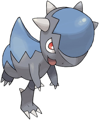
No. 408: Cranidos

knock knock, shitstain, I'm hitting you with my head

I really like that there were seriously dinosaurs who just went around and headbutted things. They could've evolved claws, or fangs, or some other more fearsome ways of doing their business, but no, they decided that they wanted rock-hard heads to headbutt the bejesus out of everything.

So, Cranidos clearly comes from good stock.

The design has a neat color scheme, and keeps it simple. I just wish he could get, like, extra STAB from using Headbutt. But he can't, because he's not a Normal type at all. Also, when you look at it from other angles, it becomes apparent that his blue "helmet" is more of a large blue rock he's balancing on top of his head, than an actual helmet.

I feel like this was the wrong idea. Like, suddenly I don't believe his head is one solid piece of asskicking anymore, and I'm worried his stone thing could get pried out? I don't really know, but it bothers me a bit.


Overall: 7/10

Friday, April 6, 2012

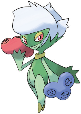
No. 407: Roserade

Remember Roselia? roses for hands, like pom-poms?

Well now meet her sexy older sister, Roserade! Except take out that "sexy" bit, that shouldn't apply to Pokemon. I don't know what I was thinking there.

Roserade has an entire frigging bouquet for each hand, a word which is apparently much more French than I remembered. Seriously, there's like 2 or 3 pointless letters in there. Anyway, Roserade has a little mask thing around its eyes, and a classy white rose for hair. I like it a lot!

If Roselia was a cheerleader or something, then Roserade, with her cape, mask, tapered legs, and bouquets, is like some sort of magician's assistant or something. Also, that little gold color? Roselia actually had a gold streak down the front, so even that little splash of color is justified! This is just a really good example of a new evolution done right. Roselia really felt underdeveloped, and now here's an excellent final form for it. As they say in France, Bravo.


Overall: 10/10

Thursday, April 5, 2012

No. 406: Budew

Budew you think about this Pokemon?

I think it's kinda lame. I like that there is now an evolutionary line for Roselia, that's neat, and it makes sense that the first stage is just a little bud, but that doesn't mean it isn't still lame.

One thing, though, is that you have to realize that the twisty bit at the top is its arms, and when it opens its "hands" you can see little red and blue bits, which I like, because then you can imagine those "arms" becoming the clearly defined arms and flowers of Roselia.

Actually, the more I think about it, the more I realize Budew is alright. I really couldn't ask for more out of a bud Pokemon. It isn't exciting, but it doesn't make any mistakes, either.


Overall: 5/10

Wednesday, April 4, 2012

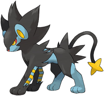
No. 405: Luxray

the King of the beasts is in the house.

It's a frikken thunder lion with Super Saiyan hair, how is this not awesome!?

Answer: in no possible reality is that combination of traits not awesome, Luxray kicks major ass and everyone knows it.

I'll point out the triple yellow bands on the front legs, though they've been covered up by black sleeve things a little bit. I also like how goddamn fierce he looks. He looks like he's Kimba the White Lion's black cousin, who had electric powers like Static Shock. Except he's not so much street-wise, as he is intimidating and feral.

I don't know where that trainwreck of references went, but I do know that Luxray is just one of the best things ever.


Overall: 10/10

Tuesday, April 3, 2012

No. 404: Luxio

Error: Pokemon not found

Just kidding, Luxio is right here, and he's pissed. Or maybe very determined. It's hard to tell.

But either way, he's doing a good job. Notice those TWO bands on his legs? When Shinx had only one? That's right, bitches, those bands are propagating. Intelligent design, here we frigging come.

Also, notice how Luxio has grown a mane, and it has hair tufts in the same places that Shinx did. Again, consistency like this is a good thing. It's the middle evolution's job to get from the cute first stage to the badass last stage, and Luxio does it just fine. He's got a little bit of that awkwardness about him, but they all do.


Overall: 8/10

Monday, April 2, 2012

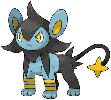
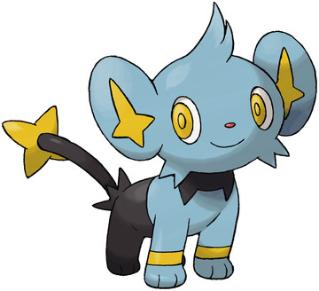
No. 403: Shinx

Shinx, baby, save me from myself.

Shinx is as cute as a button, and I like saying his name. Shinx. Shinx. Shinx. He keeps his color scheme down to 3 colors, which I think look really sharp together.

Now, he does have bands on his arms, but as you'll see, these bands actually have a purpose. They aren't random shit added in a fit of OCD about blank space at the last minute, they are a design choice that goes somewhere.

The only thing is, Shinx is supposed to be a lion cub, but his ears make him look almost mouse-ish. It's just enough to knock a point off a nearly perfect score. But I am totally digging the star on his tail, though.


Overall: 9/10

What does the outdated meme say about NAPACE's view count?

It was over 9000 for the month of March!! around 10,800, actually. That's a record high. That also brings the total tally up to just over 100,000 page views all-time.

So, thanks to everyone for tuning in.

by the way: even though I just did the 400th Pokemon review, I didn't make a big deal out of it because 400 is just such a lame benchmark number.

100 is a real big deal, 200 is another milestone. 300 shows that you aren't screwing around with whatever series of things you have. 500 is the next super-big one.

But 400... everyone's all "of course he made it to 400, he got to 300, why couldn't he do 400? Wake me up when there's half-a-thousand of these things. That'll impress me."

Then after that, people just kinda assume it's going to go on forever. 600, 700, they all fly by. When it hits 800, then people start going "is this gonna stop or what, guy? You're pushing your luck."

900 just makes everyone anticipate the big one-zero-zero-zero, because what sort of limp-dick loser stops at 900? So then you can make a big deal with 1000. After that, I don't know the rules. I think from that point onward you're either Charles Schultz or the guy who does Kochikame, and you can just do what you want.


This is all fairly pointless, though, because there being only 649 Pokemon, I won't even make it to 650. Unless they unleash a new generation in the next year or so. But anyway, I just wanted to explain why I didn't make any sort of post about 400 Pokemon.

thank you for your time.
Sunday, April 1, 2012

No. 666: Charizard

Man, Pokemon sure are horrible these days.

I mean, look at this shit. Why does he have random gold patches on him all over the place? Why not keep the belly the same color? In fact, the belly is THREE FRIGGING DIFFERENT COLORS. WHY WHY WHY.

I'm actually surprised by their restraint, not including any full bands, just little connector bars. Which are still obnoxious, but oh well. The while belly really sticks out, though. Either drop the gold, or drop the white. There's no reason to run 4 main colors in a design that is essentially "this is a dragon with fire on his tail". Why did that need to be made more complex than it ought to be.

As for the spikes on the thighs... eh, I like spikes, but they feel random and out of place. They feel like they're trying too hard to be badass, just kinda sticking more things on there until the damn thing either collapses of over-design, or suddenly becomes badass.

Guess which one this fell into.


Overall: 2/10