You'll have to excuse me, I've been battered with Street Fighter news lately and can't think of anything else


You'll have to excuse me, I've been battered with Street Fighter news lately and can't think of anything else


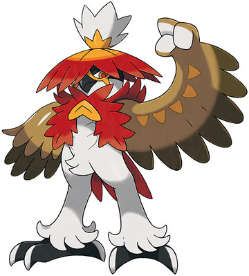
so how bout that Scarlet/Violet trailer, huh?

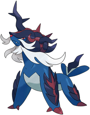
Vanilla Samurott kinda sucked, and Hisui hasn't treated him much better. He's still fundamentally dumb, with a "samurai" theme made incomprehensible due to lack of any iconic samurai motifs, and a "shell sword" gimmick made awkward due to being on all fours.
the new Dark typing gives his armor some extra spikes and flair, but it's too little too late. They had an opportunity to really redeem the design, maybe go Water/Fighting and have him stand upright, but alas. I'm gonna dock this one even lower than the original, too. Just for refusing to make any improvements whatsoever.
Overall: 3/10