Thursday, January 30, 2025

No. 952: Scovillain

 two heads are worse than one
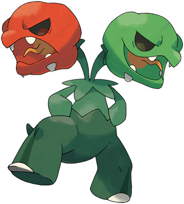
Scovillain artwork by Ken Sugimori
Well, that was disappointing. I do applaud Scovillain for the typing, the overall concept, and for bringing back the iconic Gen 1 Single White Toenail, but dear lord are there problems here. The biggest one is that those necks look ready to snap right off. I know plant stems are pretty skinny, but surely it would look better to taper in the opposite direction? (it's not just a quirk of the artwork's perspective, either - they're actually modeled that way)

Almost as important is the bizarre way those lower teeth are cutting through their jaws. I guess the teeth are supposed to be like pepper seeds, but uh... are pepper seeds known for poking through the pepper like that? It looks painful at best, and if it wasn't for the artwork I would have assumed they were a model clipping issue.


See? Now was that so hard? In my version, the red head is always the one to shoot Fire attacks, and the green head always does Grass attacks. Also it gets Drought as a hidden ability. But alas, the perfect ideal can never exist. So we are left with the flawed reality.


Overall: 6/10

Wednesday, January 29, 2025

No. 951: Capsakid

 Green Hot Chili Peppers

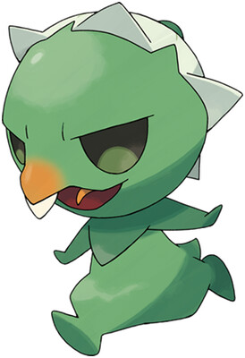
Capsakid artwork by Ken Sugimori
I was so happy when I caught Capsakid (after I realized that I wasn't looking at a random green bean zooming around near my ankles) because of two things:

One, he looks like a little freak. There's some avian features going on, like a beak and possibly an eggshell on his head? But at the same time, not really. He's just an abstract weirdo, and I want more of that back in Pokemon.

Two: He's a pepper. People have yearned for the forbidden Grass/Fire typing for years, and chili peppers is a common answer. You see it in fakemon designs all the time. To see Gamefreak doing it themselves? Hell yeah!

With that said, the single tooth bothers me. You already have a perfectly good beak, either bend that down further to complete the silhouette, or dispense with it entirely.

Overall: 7/10

Tuesday, January 28, 2025

No. 950: Klawf

 just klawful

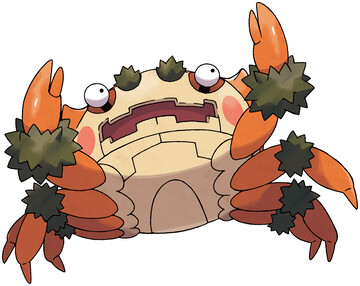
Klawf artwork by Ken Sugimori 

I tend to like crustacean Pokemon, but this guy sucks. The eyeballs sticking out on tiny little stalks bother me, not to mention the hairy joints and rosy cheeks. But the biggest offender is simply that his claws are too damn small. I don't want no teeny-weenie clawed crabs, I want BIG MEATY CLAWS!

Besides, if the concept is "Rock Crab", they sure could have done more to make him look rocky. He doesn't even blend into the walls in the game, in the environment he was specifically designed for.


Overall: 2/10