Friday, January 8, 2016

Team Flare of Kalos

I forgot about these dudes. I legit thought I had finished. I just came back because I realized I ought to do that new Legendary, and maybe Zygarde's forms, and WHOOPS the kick-ass Team Flare was sitting in the corner all dusty-like! C'mon fellas, up and at 'em!


oh wow I love these fabulous motherfuckers. For a team based on "style", they certainly fit the bill. I love the boldly colored suits, that match perfectly with their hair and sunglasses. I like how they're wearing the same exact costume, the girl doesn't get forced into a mini-skirt, but gets to rock the same uncomfortably-tight pants that the guy does. The belt buckle feels a tiny bit large, and the logo could use work, but those are minor issues and have more to do with Flare as a whole, than these two hip cats.

Grunts: 10/10

These are basically the best "official" images I could get of the admins, and it's a damn shame, because these guys are somehow EVEN BETTER than the grunts. I mean holy shit do you see that male admin's cue-ball shine? his sunglasses, head, and suit are all exactly the same amount of shininess, and that amount is DAZZLING. Meanwhile, the female admin is rocking the "I get shit done" hair, and both of them are popping their collars something fierce. I love how they have gold belt buckles, to show they're a step up from the silver of the Grunts. They look classy, like high-powered Triad members from a planet where Red is the only color that exists aside from monochrome.

Admins: 10/10


Mable is the one with the spats and the hoop hair. Bryony is the one with the green hair and the maxtrix glasses. Aliana is the one with the yellow leggings and indecent posture. Celosia is the one with the shoulder pads and the optic blast. Remember that now.

Anyway, these ladies don't really fit with the previously established theme, bringing in a pit of techno-punk, but at least they keep the design principles the same. Red is still the primary color, with white or black accents. I like how each one gets their own color, thouogh I could do without the gold kneepads. Giving them all visors (and unique visors at that!) is a cool idea, as is the way their costumes are made up of similar elements, but combined in different ways.

With that said, what are their unique strengths and weaknesses? Mable has dumb hair, but I like the shoulder pads. Bryony's color compliments the red very well, and I like how she's wearing short shorts. Aliana has dumb leggings, her color isn't contrasting enough, and her visor doesn't make any sense unless her eyeballs are oriented vertically. Celosia is pretty much perfect except for that dollop of gold on her knee.

Mable: 7/10    Bryony: 10/10    Celosia: 9/10    Aliana: 5/10


Xerosic is technically a scientist like the rest of those girls, but I think he deserves his own paragraph. First, note that this dude came here straight from doing some freaking science, he's still got his sleeves rolled up and one glove on, the other crammed into a pocket. You disturbed him from his Important Research, you imbecile. Maybe it was on skin care, because he's looking a little... dead. In any case, he's still dressed to the Team Flare Dress Code (RED ALL THE TIME), and I dig his goggles and weirdo hair. He manages to look both like a scientist, or at least a technician, as well as vaguely sinister. Odd that he doesn't wear the team's logo, though. It's not much of a logo, but c'mon.

Xerosic: 9/10


Now the big man himself, Lysandre. Cool name, large hair, inscrutable plans, and bafflingly allowed to walk around and sit in public cafes in broad daylight despite being a known terrorist who gloats about destroying the world. I have an affinity for big fluffy fur collars, so he's got one there. Also keeps the general boss theme of subverting the normal team colors - he's still in red, black, and white, but this time black takes the fore-front. Combined with the Grunts and Admins, they would make a nice set. His suit is sharp, his hair is lion-esque, and maybe only slightly too over-the-top. I'll say he ought to wear his own logo, though. And it's a pity he doesn't have a belt buckle encrusted with diamonds to show he's the Top Dogg, but whatever. Still a very solid ensemble. You can see where the rest of the fashion sense comes from.

Lysandre: 9/10


Team Flare just goddamn rocks when it comes to their outfits, let's just make that abundantly clear. These guys look organized, coherent, villainous, and fashionable as hell. At the same time, their goals are both simple and stupid - they want to get rich doing crime things, and everybody who gets in the way can take a suck. I think the last time we had such an honestly evil team was Rocket, so that's long-welcome, after a parade of bizarre eco-terrorists and well-intentioned extremists. But Lysandre had some crap ideology about "eternal beauty" and there was this ancient Pokemon-king, and somehow a crystal... I dunno, it all seems like a dream, now. What the heck was the plot of XY, anyway?

Oh, and their logo is supposed to look like a flaming F, but the lower part isn't pronounced enough and it just looks like a lick of schwoop.


Overall: 9/10

Monday, November 30, 2015

Team Plasma of New Unova

These losers returned for Round 2 in Black/White 2. While I think that's probably the best overall game in the series, it wasn't because of the evil team.


Somebody's been playing Metal Gear Solid! Grunts looking like they got dat MGS1 Sneaking Suit on. Except berets with big goofy stitching on them. Also, the masks just covering the mouths look strange for some reason. They've forgone the out-of-place crusader theme, so they're just generic Bad Guys from a Mission Impossible movie, now.

Grunts: 5/10


oh christ who's this fat piece of shit

It's Zinzolin, who has a bizarre name and even stranger fashion. Not content to wear the world's tallest ushanka hat, he's also wrapped himself in a queen-size comforter and strapped it to himself with velcro. He might not even be all that fat, actually. He's just bundled up like the snuggiest bug for a snow day. I guess Unova was freezing over at the time, but still.

Zinzolin: 1/10


Trying to take this years' "Least Probable Hairstyle", it's Corless, the new face of Plasma. He's a scientist, which is something the logic-challenge Plasma desperately needed. And lab coats almost always look good, they're basically the only times in modern society you can acceptably wear a longcoat and stride around the inside of facilities and people will take you seriously. And I would take Corless seriously, except for the water slide going on around the top of his head. Shit looks a Tamashi Nations Wind Effect piece just glued up there. Maybe he doesn't even know he has it? Could it be a giant parasitic worm, and everyone's pretending not to notice? He'd be great without it, but I gotta dock serious points here.

Corless: 7/10


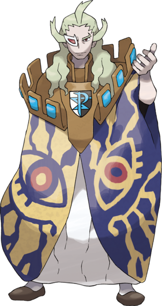
Finally, we got old man Ghetsis again. He has a cloak made out of Pride from FMA, that's pretty dope. And I think that's Sora's Keyblade? and Vegeta's Scouter? Why he looking like he's going to an anime convention and couldn't find a cosplay in time so he just threw on every piece of merch he owned? The cape is seriously bitching, but the rest I don't care for. At least it's better than his last gaudy outfit.

Ghetsis: 6/10


Amazingly, Plasma comes out BETTER in their renewed form. I think cutting away the faux-medieval theme was a smart choice, even if they're still lacking in cohesion. Oh, I forgot to mention the Shadow Triad, who showed up in both incarnations of the team, but were strangely underused and never really explained, nor do they have any official art. It's like they're shadows, lost to the world... but seriously, if Gamefreak cannot give enough of a crap to produce official art, then I won't give enough of a crap to review them. They were ninjas. That doesn't fit with anything else. Plasma is just a mess, okay? But at least Neo Plasma is a little fancier mess - like your cat threw up some caviar, instead of just kibble.

Overall: 3/10

Wednesday, October 14, 2015

Team Plasma of Unova

Remember when Gamefreak said that Black and White would have a better story than previous Pokemon games? I still laugh when I think back to those days.


Obviously, the thing that makes the most sense for a NYC-inspired region is a gang of radicalists who dress like knights. Aside from the random stitching on the hood, these are solid designs. Except, are they seriously supposed to be chainmail? If so, then cool! But why the hell are they wearing chainmail? If not, then that makes even less sense. I can understand not dressing like thugs, because they consider themselves "justice". But why knights? They didn't have a "Knights of the Round" theme going on at all, that could've been kinda cool. Anyway, my complaints are mainly about the appropriateness of the design, not the design itself. It's a decent look for low-level Paladin NPCs in some video game that isn't Pokemon.

Grunts: 8/10


There are no admins, just some old sages who don't really matter until BW2, so it's just Ghetsis running the show. And I think he's supposed to be dressed like a king, but holy shit why does he have an entire castle parapet on his shoulders? And what's with the gigantic eyes? and the scouter? Dude looks like he came straight outta Nausicaa. It's a weird, funky design, and feels "pagan" in a neat sort of way. I actually don't hate it, but I question it fitting in this environment. It also feels like it has very little to do with the Medieval theme that's been "established" - it's just too weird, for how by-the-book the Grunts are.

Ghetsis: 5/10


Then we have N, who really serves as your rival in this game. You also have Cheren and Bianca and Hilbert/Hilda running around, but since none of them are actually opposed to you at all, there's no tension. N conflicts with the player on an ideological level - you wanna catch 'em all, he wants to set 'em all free. The manner in which his ideology was just sort of hand-waved away, despite him being able to literally talk to Pokemon, was a main failing of the game's plot.

But let's talk design. He's cool! I'm saying this about everybody here, but they're all fairly alright designs - they just feel like they come from three completely different games, much less the same goddamn organization. Did N not get the memo? At least Ghetsis made some shit with paper-mache and stuff, N just walked out with his casual clothes on. I dig the style, big fan of Terry Bogard-style hats, light-green and monochrome make a cool visual look. but jesus what is he doing looking like this and being "the King" of Team Plasma. He looks confident but relaxed, and would have made a great proper Rival, maybe the best since Gary Oak.

n = x/10, when x = 9


So yeah, Team Plasma is stupid and couldn't decide on a theme. Why are they a "team" anyway, shouldn't they be a Cult? or a Kingdom? or an Order? And why "Plasma" of all things? None of it makes any sense. Their motivation seems promising at first, but then it's quickly revealed that N is maybe the only person in the entire group who genuinely believes in their cause. The rest are just going along with Ghetsis to steal Pokemon. And I still don't get N - he can talk to Pokemon, and heard from them about how awful people are, and how they want to be free, right? So why does all that get brushed under the rug? Just because you the Player are a good trainer, doesn't mean everybody else in the entire world is. Maybe there ARE some Pokemon who don't want to live and breed for the purpose of fighting. But the way the story goes, it paints N as just being flat-out wrong - Pokemon actually love this shit. It's like they called up Michael Vick's dogs at his trail as witnesses, and the dogs admitted they actually are totally into fighting each other.

I mean, for the sake of the series, the Player has to be the moral one. You can't admit that PETA was right all along. I just feel like, despite intended to introduce some morally grey subjects, the end result was very (wait for it) Black and White.

To wrap it up, "Team Plasma" fails at everything, from name, to organization, to goals, to cohesive costume design.

Overall: 1/10

Friday, October 2, 2015

Team Galactic of Sinnoh

I'm in no hurry, I hope you don't mind.


Sinnoh is my least favorite region, I think I've made that pretty clear by now, so I've put most of it from my mind. I remembered these guys being from space or something, but I had forgotten the bowl cuts. With that said, they actually look pretty solid. Definitely feels unisex like 60's sci-fi designs, complete with collar and aluminum hose arms. Logo displayed prominently, simplistic colors, yeah these work. Feel a little out-of-place as the uniforms for a human organization in what is close-to-modern day, but whatever.

Grunts: 9/10

      
The male admins at least continue the color scheme, and apparent "horrible hairstyles" executive mandate. But I dunno about the ribbing on their pants, and Saturn's arms. It worked for the grunts, because the silver suggests robot arms of something, and appeared to be skin-tight. But when you clearly have pants and a turtleneck on? Not feelin' it. Charon just looks disgusted to even be wearing his suit, though, which is probably why he's trying to cover up with a lab coat.

Saturn: 4/10
Charon: 5/10
     
Mars is looking good. Again, keeping up with the sci-fi motifs, with that Space Station 9 skirt. But Jupiter on the other hand... girl, did something eat part of your leg? What's up with that? You finna model Nina Williams' outfit in the next Tekken? It's just so distracting, two bands of flesh showing up like that. I do want to say that I love the name theme for Team Galactic, though now I can't help but think of Sailor Mars and Sailot Jupiter (best scouts) and now I'm sad that the whole team isn't dressed like that.

Mars: 8/10
Jupiter: 4/10


Goddamn Cyrus is rockin' that emo look. Baggy yet formless pants, straight-jacket looking thing on, and his face all like The Cure. Actually it's a pretty imposing glare, but that life-jacket he's got on, and those pants (which he also is wearing on his arms?) just makes him laughable. This is not what I would have expected from the boss of a kitschy sci-fi organization.

Cyrus: 3/10


I can't be assed to look up Team Galactic's motivations or goals, but as I recall they had some half-baked scheme about capturing legendary Pokemon to destroy the world. Which makes them as stupid as Magma and Aqua, but somehow less dumb, because at least they know they're gonna end the world. In any case, I've never found them particularly memorable, and honestly their outfits were better than I had remembered. Which isn't saying a whole lot.

Overall: 4/10

Friday, September 11, 2015

Team Aqua of New Hoenn

Let's check out Neo Aqua! They also got a redesign, and rebranding.

Well, they're certainly busier, that's for sure. Also looking rough, with those frayed shorts. Except they're wearing tights, and silly boots. Hey, don't those shoes look like the ones Neo Magma wears? Did they buy them at the same store? I like everything until you get below the end of the pants/shorts, I guess. Also - they're brown now! Either the whole team got a tan, or this Magma-vs-Aqua conflict has more racial tension than I previously assumed.

Grunts: 6/10


The admins are completely different. They're wearing what appears to be high-performance wetsuits, except Shelly has "fashionable" holes in hers, and Matt appears to have torn his. Dammit Matt, those things cost money! Also how the ever-loving shit did you get a reverse tan of the Aqua logo on your chest!? And what's happening around the edges of your hairline? Christ, Matt, you're a mess. Did you seriously pump so many steroids your chest and arms exploded out of your suit? I can still see it hanging on around your neck and hands there.

But Shelly, I'm not done with you. I miss the old red-head look, not gonna lie. This Empress Hancock style isn't working for me, nor is the random blue streaks. And at least Matt had the decency to put his logo on his chest, but yours is just lost in the design. If you're supposed to look like pirates, neither of you really succeeded.

Shelly: 2/10
Matt: 1/10


Now we come to the bossman himself, and he's wearing a golden anchor around his neck, like he's Flava Flav or something. And again, we see the confusion - high-tech wetsuit, but a weird frayed skirt-cape? And putting back on the bandanna, as if it's salvageable at this point. Man, this whole team redesign was a mistake.

Archie: 3/10

I like the basic idea here, I think - Magma becomes totalitarian and super-strict, almost Nazi-esque, while Aqua becomes wild and chaotic, like mercenary pirates. That works to differentiate the teams even more, but damn if the designs for Aqua did not pay off. Busy, confused, they're just ugly and only the grunts actually look piratical. Matt certainly looks "wild", but he also looks like he's lost his goddamn mind.


Overall: 2/10


Saturday, September 5, 2015

Team Aqua of Old Hoenn

Yeah, these are coming out slow. I'm in no rush, just kinda killing time until Gen 7 gets announced. Thanks for continuing to read, but I understand if you're done with this, too.

Anyway, it's Team Aqua! The other side of Hoenn's eco-terrorism boom.


I like this look a lot, you guys. Tight striped shirt immediately makes on think of sailors of Frenchmen. As is normal, the female grunt must show some skin. But then she gets to wear pants! That's pretty nice. These guys look mean and piratical, I love the bandannas and simple colors.

Grunts: 10/10


They have some admins as well, though in-game they look nearly identical to the grunts, similar to Magma. Similar as well, nobody cares about Matt, the male admin - but Shelly is surprisingly popular. And for good reason! She's basically Nami before the Timeskip even happened. I love her hair, you don't see much poofy curly hair in Pokemon, or Japanese games at all for that matter. And, she runs with the orange/blue color combo, getting it into her clothes as well. Yoithink of the New York Knicks, she got dat Mango Sentinel goin' on. Anyway, it's great - she looks like a modest Pirate Queen, definitely a rank higher than the grunts.

Shelly: 10/10


Their Boss, Archie, seems to be drawing a big page from Giovanni's wardrobe. What is it with the "wear a suit but no tie" fashion craze? I kinda like how he ain't even wearing a shirt underneath it, though - dude is ready to strip it all off at the drop of a hat. Aside from that, he's pretty boring though. Seen it before.

Archie: 6/10


These guys have a stupid goal, we've covered that. But I like the cut of their jib. The nautical theme works pretty well, even if their leader doesn't do much with it.

Overall: 8/10

Saturday, August 29, 2015

Team Magma of New Hoenn

Now let's take a look at Neo Magma, fresh from the Ruby/Sapphire remakes.


The first thing you'll notice is that they're wearing some sort of corduroy jumpsuits. Except the female uniform doesn't include leggings? that's stupid. They've also become just visually busier, and have taken up some stricter discipline. Now, this I don't mind - it gives the overall team some character, and especially sets it apart from the rowdy Neo Aqua guys. But now that they're no longer punks, their hoods look weird. You need some Hugo Boss-level uniforms to pull that shit off properly. Instead, these grunts look like they're wearing awkward snow suits.

Grunts: 3/10


The admins have also been revamped, and given more personality - which is also a good thing. But all the problems with the Grunts uniforms persist, and in face have gotten worse. The logos are just tiny label pins, you can't really see them. Yellow has been added for some reason, and Courtney appears to have some non-euclidean clothes going on with her vest there. Meanwhile, we got Tabitha (which ain't no name for a boy) who isn't even wearing his hood. What happened to the discipline!?

Courtney: 2/10
Tabitha: 3/10


Finally, Maxie. He's certainly looking like he values discipline and order, and I accept his label markings because the Big Boss ain't have to front as hard as his subordinates. But he still seems to be wearing a full-body sweater, and has cut-outs in his boots for absolutely no purpose I can imagine. And what's with those glasses, do they have frikken sideburns? Why??? Basically, he looks like a nerd and I hate him.

Maxie: 2/10


Yeah, the remakes really screwed Team Magma up. Again, I like the effort to make them feel like a different cultured organization compared to Aqua, but the designs really do not work with that. Or look good on their own.


Overall: 3/10

Friday, August 21, 2015

Team Magma of Old Hoenn

I'm going to treat teams Aqua and Magma differently between the originals and the remakes, because unlike Team Rocket, they took significant re-designs and rebrandings. With that said, here's Classic Magma.

Whereas Team Rocket looks like uniformed agents, Team Magma look like thugs. Hoodie, baggy pants, yeah I see that stereotyping in action. And they keep it simple - red and black. Logo on the chest as plain as day. The only difference between the gendered uniforms here is miniskirt vs awkward pants that end at the mid-calf.

Grunts: 9/10


Magma had two admins back in the day, but I can't find any decent art of the man. So instead here's the lady, who basically looks exactly the same as the female grunt, except she gots spiky horns and a longer skirt! With more rank, you can afford more fabric it seems. Not much to say here, it's still a solid design, but maybe you could flaunt your rank a bit more?

Courtney: 7/10


The leader of Team Magma is this dude. He doesn't dress like a punk, instead he's wearing one of those chinese-style suits that button down the side of the torso and up to the collar. It's simple and decent enough, except the cutoff between red and black just seems arbitrary. Why not wear an all-red top, with black pants? or maybe red torso, black sleeves? Yeah, just not feeling this one.

Maxie: 5/10


Their logo is simple, and looks like a mountain with maybe some lava boiling up underneath - very fitting. And it also kinda-sorta looks like an M? for Magma? eh? eh? Also, if you try really hard and believe deep down in your heart, you can pretend it looks like an Omega symbol. So the logo checks out on pretty much every front.

The problem, though, is that Team Magma's goals are mind-bogglingly shortsighted and lack justifications a 6-year old couldn't poke a hole in. Their plan is like something the Insane Clown Posse would come up with because they got water in their shoes one time, and in fact I think they DID drop a line that sums up both of these moronic teams - "What's with water? get more land / What's with deserts? get less sand."

I mean seriously. If you dry up all the oceans, then everybody dies. That's simple shit, people. You know what makes this planet so habitable compared to, say, Mars? FREAKING WATER. God, Maxie is stupid. And everyone IN the team is stupid to go along with his bullshit.


Overall: 7/10

Your logo and grunts are cool, but your leader and ideology - not so much.

Saturday, August 15, 2015

Team Rocket of Kanto (and Johto)

As has been requested, I'm gonna do some more design reviews of the Evil Teams. I'd say the main content of this blog is pretty much over until Gen 7 happens, so I don't blame anybody who just tunes out. If you do, please remember NAPACE when that day comes! I guarantee I'll still have steaming hot opinions about the Pokemon in it. But for now, let's talk Grunts.


The Rocket Grunts designs are just goddamn perfect. Seriously, they're friggin' works of art. Logo is simple and recognizable, and they look both practical and somewhat threatening. Also, as Jessie and James proved, swapping the colors around for black-gloves-on-white-uniform is just as neat. I have seriously nothing bad to say about these classy peeps.

Grunts: 10/10


Team Rocket seems to have two tiers of executives - those that just wear fancier versions of the usual grunt uniforms, and those who get the inverted white models. Proton and Petrel are of the former, and they're pretty cool I guess. Not sure why Proton has gloves that go up past his elbows, though. One criticism I would give is that the orange and yellow lines, while not offensive, seem to kind of go against Rocket's monochromatic stylings - everybody else only uses black, white, and that trademark Rocket Red. Still, rather sharp outfits. Petrel gets the edge because of his cool hair and "as if I give a crap" swagger.

Proton: 7/10
Petrel: 8/10


With the top-level executives, we're back to the basic colors, but inverted - to show that they run this shit. there's a fan theory that Ariana is the mother of Mars (of Team Plasma) and the Rival (of gold/silver), and while there's nothing going for it aside from hairstyles, I'm willing to entertain it. Having an absent mom who is a crime boss explains why your Rival is such a little pissant.

Anyway, these two look great. They sport their R's on little breast-patches, as does the Big Boss himself, and share his look of a suit-coat with no lapels or tie. It's an odd, minimalist choice that I really like. The only thing "wrong" here, is that Ariana has a diamond on her pelvis for no reason.

Ariana: 9/10
Archer: 10/10


As for Giovanni, we all know he's a badass. I docked him points as a Gym Leader for not reppin' his Element, but as the boss of Team Rocket he's amazing. Refer to my older review here, but also remember I was looking at him through a different lens then.

Giovanni: 10/10


Anyway, the team as a whole feels very cohesive, and is probably the best Evil Team in the entire series. They come back for a rematch in the second generation, and it's just great fun beating them down a second time. I appreciate how their motivation was just "make money", because that's what a mafia-style criminal organization does. If you commit crimes in the name of your ideals, you're probably a terrorist or a politician.

Team Rocket Overall: 10/10

Wednesday, July 29, 2015

The Worst 25 Pokemon of All Time

This is it. This is what this blog was founded on. Some Pokemon are really aces, you guys. They're cool or cute or badass or whatever!

Then you get some that are blights on the face of mankind. Specimens so awful, it's a wonder they were ever brought into the daylight. Horrific fusions of poor taste and misplaced design goals, I despite every single one of them with an unhealthy passion. But all that hate eats you up inside. And so, with this, I consider it case closed, I feel merely pity -

Sadly, not all Pokemon are created equal.


25. Barboach
24. Cherrim
23. Druddigon
22. Barbaracle
21. Phione
20. Smoochum
19. Rhyperior
18. Burmy
17. Garbodor
16. Kyurem
15. Mime Jr.
14. Cherubi
13. Staravia
12. Mothim
11. Azurill
10. Sigilyph
9. Wormadam
8. Drapion
7. Mega Manectric
6. Mega Aerodactyl
5. Tranquil
4. Uxie
3. Zygarde
2. Klefki
1. Dunsparce

Now, how about you? I'm sure you have a shit-list. Give me your bottom 10s!