Monday, June 30, 2014

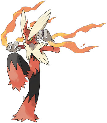
Mega Evolution No. 18: Blaziken

you know who needed a mega?

Me neither, but it probably wasn't Blazekin. Girl was OP already, but just as Goku somehow needed a SSJ4, so too do we have Mega Blazekin.

Anyway, this guy isn't too different in design. burned black replaces the yellow, grows that friggin' unicorn horn that so many Megas just seem to get, and her hair flairs up like wings. none of it remarkable, but none of it offensive.

The flame threads coming out of her wrists, though, are pretty awesome. Blazekin always kind of disappointed me by not having an open flame at all times, so flaming trails on the hands is a good way to make up for that. It's like if she had his hands wrapped with tape like fighters do, but it's coming undone. That's badass. I like it.

the rest is as I said - you have to look carefully to tell what they changed. I think this one could've gotten pushed a little bit more.


Overall: 7/10

Saturday, June 28, 2014

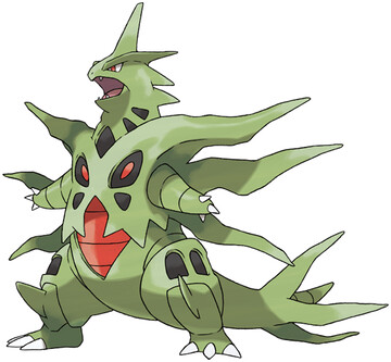
Mega Evolution No. 17: Tyranitar

SKREEEEEEEEEEEEEEEEEONK

So, if Tyranitar is Godzilla, then Mega Tyranitar is like Space Godzilla. or maybe he's that form of Godzilla from when his heart was undergoing a nuclear meltdown and his chest was glowing red and stuff.

Either way, it's extreme. Those spike dealies look impractical as heck, probably make moving around a pain. Actually, looking at his tail, it's like he's peeling. gross.

I dunno, this one isn't too bad, but it isn't too good either. It's just Tyranitar but with more spikes. and angry red. meh.


Overall: 4/10

Friday, June 27, 2014

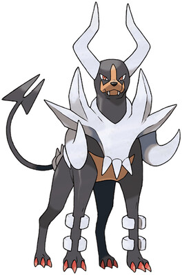
Mega Evolution No. 16: Houndoom

WHO LET THE DOGS OUT? WHO WHO WHO - okay someone kill me please I'm sorry

Houndoom was a bad doggie. Like, we're talking "would eat a baby"-tier evil. The kind of dog that people tell you is so nice, but then you reach down to pet it, and it snaps at your hand, and maybe it doesn't actually bite you, but you can just tell that it wanted to. And Mega Houndoom is even, uh, evil-er.

More spikes, forked tail, bigger horns, sinister glare, we got Satan's own pooch right here.

I like the continuation of his "armor" being like bones, especially the tusks coming out the front. But other than that, it just takes the already established theme and pushes it even further. The musculature itself also looks a bit leaner and meaner, so it's not just new plates on an old dog. or at least it doesn't look like it.


Overall: 8/10

Wednesday, June 25, 2014

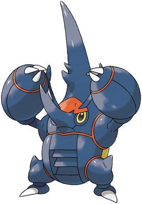
Mega Evolution No. 15: Heracross

the scores are oscillating wildly over here

I mean, what in God's name happened here? Heracross isn't red, not at all. or yellow. I'm displeased.

I also don't like his new horn configuration. THe antenna are awkward and in the way, just cut those out entirely I'd say. But then he's got a funky little nose, and then a SUPER TALL HEAD, is what it looks like. it looks dumb. I know it's closer to what actual rhinoceros beetles look like, but I thought the thing about being a Pokemon is that you can pretend nature is cooler than it actually is?

I would have just kept the frontal , forehead-mounted horn. Megalon-style, yo. ain't nothing wrong with that. The popeye forearms are okay, and according to some pictures I've seen they open up like wings? that's pointless but kind of cool. not cool enough to save this turd, though.

oh, and I hope I don't have to say how stupid that air vent in his stomach looks. because it looks stupid. the air vent in his stomach.


Overall: 3/10

Sunday, June 22, 2014

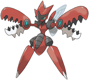
Mega Evolution No. 14: Scizor

Yes. Yes in-frikken-deed

After so many underwhelming Megas, it's about time for something truly badass. Mega Scizor has nightmares on the ends of his arms where his hands should be, and Strike Witches legs for some reason. whatever.

But he gots a cool ninja crest, some more armor bits, in generally just looking like he's deserving the extra Defensive boosts he gets.

But let's get back to those claw/jaw/saw/nightmares we were talking about earlier. Scyther had, well, scythes. just some blades. Scizor stepped it up with claws, but honestly, they didn't look nearly as sharp or dangerous as Scyther's. But Mega Scizor looks like he's packing some serious firepower. Look at those babies, they even have spikes on the underside! why would you even need that BECAUSE IT'S BADASS


Overall: 10/10

Tuesday, June 17, 2014

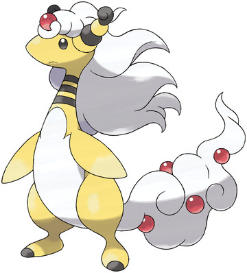
Mega Evolution No. 13: Ampharos

this will never not be hilarious

I mean, not a single bit of it makes a single bit of sense

Ampharos, of all Pokemon
gets a Mega Evolution
where it gains a Dragon sub-type
and grows luxurious flowing hair and nothing else

I guess it's sort of trying to make up for Amphy being all sheered, like I complained about iirc. making it wooly again. But with THAT hair? that Limozeen-brand hair? and the tail that looks like a whipped cream topping with cherries in it?

I want to give it points for being ridiculous, but, that awkward hair on top of that skinny neck, and how it just looks so frigging tacked on, like a bad sprite edit - I'm sorry, I just can't take it remotely seriously, or think it looks good on any objective level. Like Steven Tyler.

and this was one of the first ones they showed, too. Like they were so damn proud of this concept, THIS is what they wanted to represent this new idea of "Mega Evolution".

I don't know if I'll ever stop laughing.


Overall: 1/10


Thursday, June 12, 2014

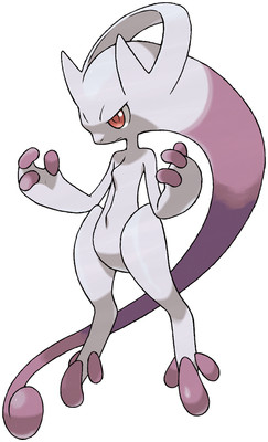
Mega Evolution No. 12: Mewtwo Y

Design by Gamefreak, Beats by Dre.

So if Mewtwo is Freiza, and Mega Mewtwo X is Super Buu, then that makes Mega Mewtwo Y Kid Buu, right?

alright, so, this one is kinda radical. tail is now a head-tail, and his neck tube whatever is now the bridge of his headphones? I can dig it, I suppose. that chest ridge looks kind of dumb, like they just threw a line there because they got scared of blank space.

I like the fingers and toes being different colored, always love that shit. and I think the concept works well, it's like how Buu and Frieza got their most powerful by slimming down and stuff. I actually had an idea for an evolutionary line that works like that, only gets stronger but gets less and less physically intimidating.

so yeah. This was one of the first Megas announced, and a lot of people had kneejerk reactions, but I think I actually like it more than a bit.


Overall: 7/10

Wednesday, June 11, 2014

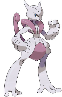
Mega Evolution No. 11: Mewtwo X

Finals hit me really hard, and E3 hit me even harder. But I want to get back in the saddle now.

Mewtwo really didn't need to get any stronger, but I guess here we are. He picks up a Fighting sub-type, which is kind of cool, and looks like he lost that pear-shaped physique, so he's ready to tear it up.

I don't know, this one doesn't look too bad to me. I'm not sure I see the point exactly, but I'm going to wear out my keyboard if I have to type that every single Mega Evolution I review.

Design is well-proportioned, relatively sane, and keeps key elements like the crotch-tail, balls on his toes, and head shape, but looks more like an alternate forme than a step up. Like if Deoxys has Attack Form, this is Mewtwo's Attack Form.


Overall: 5/10