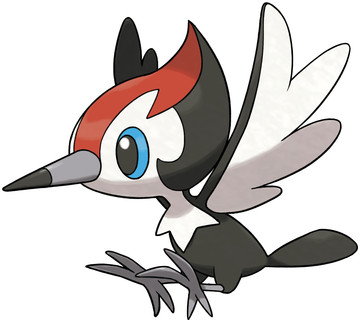
New region, new piece of crap bird. It never changes. Kinda looks like those little cardinals that are all over Hawai'i, so that's nice, but in the end nobody has any reason to give a single shit about this little dude if it weren't for his evolutions.
So instead, I'll just take this opportunity to point out another mounting problem with Pokemon. Back in Gen 4 we complained about them being over-designed, but these days we're seeing a different sort of under-designed aspect, where they make the pokemon exceedingly simple for the modelers/engine.
The fur and feathers get simplified into smooth little spikes or flaps, it's the clay-style I was talking about earlier with Popplio. Granted, this re-designed Pikipek is still super boring because it's just another bird, but it looks as if the artist was at least trying.
Overall: 2/10

Muhuhaha.. muhuhaha... muhahahahahahahaha
ReplyDeleteReally..I never saw it from that view. It does make sense what you say. But I didnt need a flying type anymore and had lots of space to put others into it.
ReplyDeleteThough the minimalistic choice might come from the deciscions made in nowadays animation. Just look at Adventure time and Steven universe.
I am theorizing that this may be in turn to make it easier for kids to redraw their heroes in those series (which in no way mans that the animation is bad in quality, far from it) thus making them easily identifiable and more unforgettable when they redraw them themself.