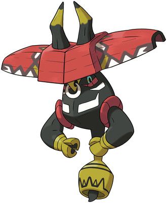
You know, for some reason I don't like this guy. Once again the shell looks totally superfluous to the rest of the design, and he almost looks like he's upside-down. Something about how his arms connect to his body. Basically I don't believe that he even fits inside his shell.
And get this - he's Grass type. Yeah, that's definitely what I think of, when I think of red-and-gold bulls, some damn ass vegetables.
Dummy broke his horns flipping open his shell and that just further confuses the silhouette, plus he has stupid hands that look like they can't even pour a bowl of cereal without making a huge mess all over the floor. And that's the #1 criteria I look for in a Tapu, obviously.
A lot of words written to say that basically, man is just ugly.
Overall: 2/10

But it is a bull, it should have hooves instead of human hands or whatever. What about Taurus and Miltank and every other ungulate-based Pokémon? They shouldn't have hooves either?
ReplyDeleteIt is a fairy, it is fine for them to have a more fantastical design than other Pokémon.
And you really don't associate bulls to green fields of grass? I agree with you that Tapu Bulu is very ugly, but I think your reasons are a bit non-sensical.
Tapu Bulu is such a mess because it is different from the other Tapu, while Lele, Koko and Fini have a dainty and fragile-looking main body with a outer shell representing the totem animal, Bulu's main body itsef represents the totem. A bull. Which is a animal far far away from dainty and fragile. Gamefreak couldn't make these antagonistic concepts work together.
ReplyDeleteFinally the outer shell just stand there, awkwardly redudant and complicating the silhouette.