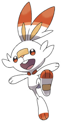
I hate that Scorbunny's feet are longer than its legs. I hate that it's head is larger than its body. By all accounts, it shouldn't work on a biological level.
And I know that rectangle on its face is meant to be like one of those nose bandages that rough-and-tumble shonen boys or tomboys get to show that they... do sports and are frequently injured (?) but the positioning makes it look like a damn single of cheese slapped on to its face. Then it stepped in some, too.
Overall: 2/10

I really didn't like this design at first but it has grown on me since because I realized that it was designed to resemble an Olympic mascot since the region is so sports focused.
ReplyDelete