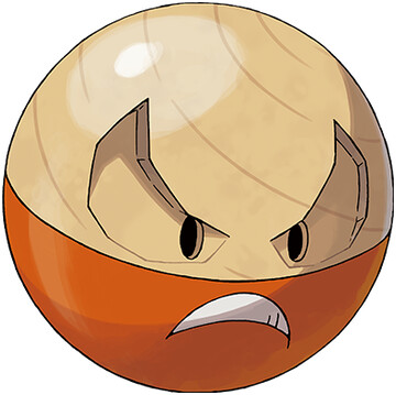
The Orb

nah but this one just looks like dogshit. I was stunlocked by Hisuian Voltorb, but Hisuian Electrode makes me think maybe the whole concept is dumb as hell. Why does it still have a cartoony mouth, but its eyes look like they were carved into the wood?
And if your concept is "ye olde Electrode" then surely the way to go is make them look like those round ninja explosives? It's hype to get the first Grass/Electric type, but I still think that should go for a solar-energy Pokemon, not these woodblock bitches.
overall: 2/10

What I think they did wrong here is the eyes. Electrode has small eyes and big eyebrows, and here they kept the small eyes but kinda turned the eyebrows into more of a goggle shape which looks bad. Especially since they emphasized Voltorb's eyebrows _more_ than the original's. So I hate the eyes.
ReplyDeleteThey also kinda dropped the ball with the wood grain, I think. As far as I know, this is the first Pokémon design with exposed wood (as opposed to bark). They highlight that by drawing a grain pattern, but then it's just centered ... somewhere in the corner I guess? Rather than doing anything interesting or purposeful with this texture. This is especially true for Electrode.
I really like the concept of a solar energy grass/electric Pokémon, though I wonder how to do that in a way that's new. In a sense, Sunflora for example already does this, explicitly drawing energy from the sun and then using that to Solarbeam. But if we're going for something closer to photovoltaics, it would be more machine-like, making it closer to electric/steel than electric/grass. But surely this is possible, I just don't see it yet. I would like to, though.
I feel like the wood grain having more than an angled concentric pattern would've been overdesigned/distracting imo. I don't think the wood grain is where they dropped the ball, I feel like not doing anything interesting with the face unlike H-Voltorb is where it went bland
DeleteFor sure. The face is a much bigger problem than the grain.
DeleteHeh, "dropped the ball"
DeleteHehe. Unintentional pun.
Delete