
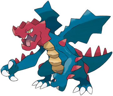
In all honesty, Druddigon is freaking terrible. It looks like it was drawn in crayon, with serrated edges substituting for scales/spikes/muscles. And not even crayons from those nice 64-color sets. No, this was drawn in a restaurant on the back of a children's menu with a shitty set of restaurant crayons, where they only give you a crusty red, waxy blue, and tallow yellow. You can't even mix the colors to make the more advanced ones like green or purple, either. No matter what you mix, it becomes brown.
anyway, those wings are atrocious. They look fake as hell. The head just kinda sits there, completely disassociated from the rest of the body. If it was the upper jaw, it might be okay. But it isn't, so it isn't okay. And we don't even have to mention the belly plates, or the red dragontales-looking spikes just thrown goddamn everywhere.
You know, maybe this was a shot at Western conceptions of what a dragon is, from a salty Japanese designer. "they think they're so cool, drawing dragons standing upright with spikes and not even a single whisker," he thinks, "I will show them the error of their ways with a parody piece".
but then it got accepted by accident. bad luck all around.
Overall: 1/10
That's exactly what I thought the first time I saw this thing, never liked it. It seriously does look like something a kid drew up, and colored, only the edges are where they couldn't color in the lines right.
ReplyDeleteHey let's give credit where credit is due...that restaurant would also need to hand out a pencil
ReplyDeletePoor guy...
ReplyDeletehttp://gelbooru.com/index.php?page=post&s=view&id=941652
(May contain NSFW ads)
The overall shape of the body makes more sense once you realize that it is a gargoyle... But the coloring still makes no sense whatsoever. I have a different idea of how it got made. It's like it was originally drawn in black and white, but by the time they colored it in later they forgot it was supposed to be a gargoyle and gave it a pure Dragon typing instead of Dragon/Rock.
ReplyDeletehttp://i.imgur.com/oVyczEk.png
It's amazing just how much better it looks, just by simply desaturating it.
http://i.imgur.com/5EGljTI.png
And here's a recolor. Now I just can't look at Druddigon without thinking about how much Game Freak screwed up with it.
I was pretty surprised when I found out how hated Druddigon is. I always thought it was an awesome design, grounded in the jagged and intimidating stature of gargoyles. The red is bright but I don't think it's a problem.
ReplyDeleteIt looks like a deformed Dinosaur that got run over, slipped in a few paint cans, then got left in the sun to rot. Oh, how I despise this thing.
ReplyDelete