Wednesday, December 31, 2014

Brycen of Icirrus City

[kabuki intensifies]

For some reason, Brycen feels out of place in Black and White. He seems to me like he ought to be from the Gold and Silver games. Possibly because his limited color pallette seems very easy to accomplish on the GBC, and possibly because in my head I'm conflating Pryce and Falkner.

In any case, I never got much of a read on him. He's stoic, I guess? But also theatrical? Or rather, he also has a job as an actor. Man, what is it with these gym leaders all picking up part-time jobs? is job security that poor for being a Gym Leader? (I guess it is, seeing as how a good number of them were replaced by the time BW2 came out)

So I got nothing against the guy, except that I now realize his hair hangs down despite also going up in a braid. That's really freaking stupid, just do the braid and lose the rest.


Overall: 5/10

Sunday, December 28, 2014

Skyla of Mistralon City

Does she remind anyone else of Mega Man? Or is it just me?

But seriously, between Skyla here and Elesa, I'm detecting an uptick in the fanservice department. Especially with the Black/White female protagonist wearing Daisy Dukes. And I can't say I'm complaining, no sirree, I'm just saying I'm noticing it.

Last time we had a Flying-type gym leader lady, she was utterly forgettable. I think she was wearing a flight jumpsuit of some sort? Maybe with wings on her head? In any case, Skyla obviously took the lesson - to get remembered, show some skin and get a nice tan because it's bikini season in Unova or something.

Skyla's got a spunky personality, a propeller in her hair, and makes a flight suit look good. What's not to like?


Overall: 8/10

Monday, December 22, 2014

Clay of Driftveil City

The only hard part of Black &White. But maybe that's because 4 out of my 6 Pokemon were Weak to ground, and I didn't have a single Pokemon Good against it...

I kind of like this take on the classic Cowboy. Instead of being yeehaw 'merica, he's basically an oil tycoon. Which is a stereotype I don't see that much anymore.

So I mean, Clay could have run with it a bit more. Maybe an all-white suit, more rhinestones and fringe, I don't know. And as it is, he's got quite a bit of colors going on. I think it's the patch of blue on his crotch that's bugging me, I wish he just wore brown pants, or just blue jeans. The chaps look odd.

Still, he's alright. No Elesa, but a far cry from the infamous Busboy Bros,


Overall: 5/10

Sunday, December 21, 2014

Elesa of Nimbasa City

"Let it go, let it - " oh wait, Elesa, not Elsa. Nevermind.

She's stylish, she's poised, she's hip, and I can't decide if those are flesh-colored panels on her front, or actual cut-outs. I'm hoping for the latter.

Elesa is really cool. Not only does she have her colors down, but her heaphones look like gigantic earbuds, except maybe the tips of those cords can be used to electrocute people. I don't know.

But I do know that she's hella chic, and so the nation-wide search for an exemplary Unova Gym Leader at last comes to an end - we've found our girl. Her gym is also pretty cool, and I liked her hometown a lot as well. I spent more time there than I did in the supposed "big city" of Castellia.


I'm not sure I like her second outfit as much, because it seems a little too lady Gaga for me. I guess that's the point, because she's a fashion model? But the gigantic puffy coat really isn't working thematically with her swimear-looking outfit, and you've lose the earbud connection with her headphones, meaning the random red just seems... random.

It's like she Mega Evolved, and turned out about as well as most Megas. And since I took previous redesigns into account, I'm afraid this has to count against her overall score. A pity.


Overall: 8/10

Friday, December 19, 2014

Burgh of Castelia City

this man came dressed as a fruit salad

Is it too much to ask for a manly Bug specialist? Isn't Kamen Rider a thing for you, Japan? Instead we keep getting androgynous little boys and effeminate men. But for what he is, I kinda like him.

His hair is fabulous, and dat color coordination is godlike. Also dig that butterfly belt buckle. And how he lined up the stripes on his belt to match the stripes on his pants, because when you look this good you don't do things half-way.

Also this guy has more than one iron in the fire - he's a successful artist, so even if this whole Gym Leader thing doesn't pan out, he'll be okay. I respect that.

However, he's only tangentially Bug-related. Honestly looks like he would be at home in an Elite Four group, where they seem to be more lax with how thematical you dress.

The search for a good Unova gym leader continues.


Overall: 5/10

Wednesday, December 17, 2014

Lenora of Nacrene City

Arguably offensive?

On one hand, she's pretty much your usual Mammy caricature - a large black woman with red lips, an apron, and a headscarf. Except I don't really feel any malicious intent here - just a sort of misguided attempt at someone in Nintendo telling Gamefreak to include "more diversity", and unfortunately Japan's idea of black people is restricted to Bob Sapp and google images.

And even if you don't feel offended, Nintendo clearly decided that something needed to change, because after a short while they removed the apron from her artwork and anime appearances. I don't remember hearing any noise about it at the time, so probably it was just an internal decision once the game got into the hands of NOA's marketers.

Unfortunately, even setting that aside, Lenora is still boring. Normal-type leaders tend to be, and she just feels like she hasn't really gotten into her role yet. I guess her gym was fossil themed? She could do a lot more to look like an archaeologist, historian, explorer, something.

Again, she's just not worth getting offended about, or even caring about at all. It's an ironic shame the first black Gym Leader is so... vanilla.


Overall: 3/10

Sunday, December 7, 2014

Cress of Striation Gym

what the metaphorical shit


This sumbitch named Cress, which isn't anything I think a man have any business being named. And his Japanese name is Corn, which is not only utterly irrelevant but also stupid as hell.

Because I mean seriously - dude looks like he got a head like Max & Cheese when they did that Shrek crossover with the blue food coloring instead of orange. Droopy goopy meatball on a stick pastaroni head.

Is he supposed to be the "cool" one? Or, god forbid, the "sexy" one? I balk at the very idea. Ladies  in the audience, back me up on this one - would you want this dopey Dr. Suess-ass piece of shit serving you wine and parfaits and biz? I wouldn't. I'd punch him in the face, or maybe give him the Stone Cold Stunner.

I also hate his pose, "did I do that?"-style bullshit, get out of here, man. There's no way anyone gave this loon control of a gym. Actually, the reason they all share the gym is probably because it takes three of them to do the job of a normal human being.

If I had to pick two words to describe the abomination I see before me, they would be ABSOLUTE and ASS.


Overall: 1/10

Thursday, December 4, 2014

Chili of the Striation Gym

Oh hell I hate guys like this

You know the type, that anime character who only shouts and fist-pumps all the time and can't shut up about how FIRED UP he is, and basically just acts a fool and gets everyone else in trouble but then thinks he can laugh it off. Black * Star is literally the only time this character has been done right. And possibly Takeshi Sendou of Hajime no Ippo, but I'd argue his character has a bit more nuance to it.

Anyway, Chili has an ass for a head and a head for an ass. He's unrealistically hyped up about being a shitty gym leader in a podunk little town, where he acts as a goddamn waiter. And he makes sure to try and type-trump your starter, like a douche.

Now, chili gives me gas, but I would've give a single fart for Chili. I can't even imagine how he thinks he could look like anything even remotely approaching a "cool person".


Overall: 1/10

Wednesday, November 26, 2014

Cilan of Striation Gym

oh god what day is it. what year is it. HAVE I REALLY BEEN ASLEEP FOR SO LONG!?

Yeah, sorry about that. Came down with a bad case of "new job" and though I remain unfortunately employed, I would feel awful letting an entire month go by without a single post.

A pity Cilan is what I have waiting for me. This rutabaga of a human being is so utterly devoid of personality, one might confuse him for a bit of topiary, or perhaps an unusually large speck of dust on your glasses.

His name is Cilan because his Japanese name is Dent and that doesn't make any goddamn sense. Cilantro is at least something related to plants, which he uses. Also he replaced Brock in the anime, for some unknown reason.

But mostly I hate that he's a waiter. I have a pathological hatred of waiters, especially hoity-toity ones like this. He probably expects a 25% tip regardless of his service. Tough luck, chump - just as I balk at sales tax, I balk at tipping. Oh, of course I do it, but I hate it.

"Oh don't mess with waiters they'll spit in your food" I hear you say. Screw that noise, no other profession has to be bribed to NOT be a total ass. I'm sorry you aren't paid well enough, maybe you should unionize and do something about it. Just mark up those "tips" into the menu ahead of time and we'll go from there. I hate the feeling of buying a nice 10 dollar meal and then having to scrounge around for the extra dollar fiddy. Europe, despite being our backwards cousins in other regards, at least has this figured out.

So yeah Cilan can choke on it. But he gets a bonus point because his brothers are even worse.


Overall: 2/10

Monday, October 13, 2014

Sinnoh League Champion Cynthia

a classy dame indeed

After a mediocre Elite Four, you finally get to Cynthia, who's so cool you get the idea she could solo the previous four with no problem. She doesn't stick to one type, which is perfectly fine and maybe even should be encouraged for a champion. I didn't really care much for my playthrough of Pearl (as you may have gathered by now), but that final confrontation with Cynthia was definitely one of the highlights. It came down to my last guy, and her Lucario. I don't remember the specifics of the battle, but it was great.

And likewise, Cynthia's design is great. I love how her clothes somehow both resemble a no-nonsense business suit, but also an elegant ball gown. Black fur trim really helps.

What's cooler, is that she shows up in the next game. Just hanging out like a badass in her private ocean-front property, of course. I love it when Pokemon does this, acknowledges that it takes place in a connected universe.

Oh snap, noticed one more thing - the tips of her shoes - also have a thin yellow band, just like her hair accessories. Gotta love that devotion of fashion.


Overall: 10/10

Friday, October 10, 2014

Lucian of the Sinnoh Elite Four

Objection!! That's actually Miles Edgeworth, not a Pokemon Trainer!

No, it's just Lucian. Though props to this guy for actually sticking to a theme - Aaron and Brenda didn't look the part at all, and Flint wasn't even trying.

Because while he may not eccentric as hell like other Psychic-type masters, you just look at him and know he's gonna do some freaking magic. Possibly with his fingers. Because really, who wears burgundy suits and has wavy purple hair, except magicians?

He's stylish and understated, which would make him stand out against the usual Elite Four crowd (a dude going to a masquerade ball, a shirtless sailor, a ninja, literally Ryu, and a man in a full suit of plate armor). However, as we've seen, the Sinnoh Elite Four isn't the usual lineup. They must have run out of costuming budget, because these basic bitches are still just wearing whatever hell clothes they had on when they got the job.

I mean, you're slick and all, Luce, but I would not bat an eye if you were just a Cool Trainer on Victory road.


Overall: 5/10

Thursday, October 9, 2014

Flint of the Sinnoh Elite Four

holy shit it's Ronald McDonald

An entire color combination has been forever tainted by a single, ubiquitous character. Though having a red afro doesn't really do you any favors in not being compared to the Ran Ran Ru.

Also, Flint is supposedly a Fire user? despite the fact that his Diamond/Pearl team features more non-Fire types than it does Fire types. Maybe you should've thought of the immense scarcity of Fire in Sinnoh before you decided to make a trainer specialize in the type, Gamefreak. Maybe you should've put more goddamn Fire types in the game in the first place, Gamefreak. Why don't you look me in the eyes when I'm speaking, Gamefreak.

Yeah, I know he got fixed in Platinum, I don't even care. Dude looks dorky and uncommitted to his type. Maybe with a yellow afro and a red shirt? Or would that be too Bo-bobo-esque.

As it stands, Flint should go back to flipping burgers.


Overall: 2/10

Wednesday, October 8, 2014

Bertha of the Sinnoh Elite Four

Has anybody with the name Bertha ever been taken seriously?

It's not about to start now. We already had the "badass old lady" gimmick character, so another one is just annoying. It's like they forgot they already did one. And she uses Ground-type Pokemon, for absolutely no reason at all.

Also that's just an ugly scarf she got on. You don't freaking wear a brown scarf with a white coat and black dress. And what's that red? Christ, you'd think for someone so old she would've learned a little bit about fashion by now. Looks like she just grabbed the first 5 items she saw at Goodwill and called it a day.

I'm kind of surprised myself that I'm being so mean to a poor old woman, but I mean, c'mon. Sometimes people are just ugly and lame. Even old people. Who have, you know, historically been associated with "beauty" and "coolness".


Overall: 1/10

Sunday, October 5, 2014

Aaron of the Sinnoh Elite Four

Remember Aaron Carter? And 98 degrees? And *NSYNC? Doesn't it all seem like a dream, now?

Nice to see a Bug specialist so high up. Usually Bugs get relegated to the opening stages, as early bugs are usually bootysweat. And I guess green hair is something I could associate with insects.

Other than that, Aaron just looks like the "cute" love interest in a shoujo manga. you know, one of those ones that make like they're about action and stuff but are really just about how much each of the male characters wants to protect the blank slate female lead?

Not much else to say here. Generic design with unappealing shades of green and orange.


Overall: 4/10

Thursday, October 2, 2014

Volkner of Sunyshore City

I want this man's style

No kidding, Volker looks mad chill to me. Blue + Yellow is always striking, and I dig the sideburns. Cool jacket, too.

Also, you gotta admire this motherlover's attitude. Everyone else standing up like tool, not this cat. Gotta sit down, the weight of being a badass gets heavy once in a while nawmean? ay, not even gonna sit down on some chair or whatever, just gonna pop up my red shadow-seat and pop a squat, no big d. defying physics like it ain't no thing.


The badge is - well, I've seen worse. I guess I can pretend it's a lighthouse. Oh yeah, that's right, the Gym Leader with a lighthouse in their town is actually Electric, instead of, oh I don't know, STEEL. That's right, Jasmine, I'm talking about you. Stop crying, nobody cares.

Especially not Volker. Dude got more pressing things on his mind. But seriously tho, what's he thinking about so hard? Left the stove on? trying to remember all the names of the 7 dwarves? thinking about some trifling friend indeed?

Volker has a subtle style that still immediately reads"electric type", and his pose and mannerisms instantly characterize him. One of my favorite Gym Leaders ever, actually.


Overall: 10/10

Sunday, September 28, 2014

Candice of Snowpoint City

shimapan socks

There seem to be an awful lot of energetic school girls getting made Gym Leaders. But I can't say I dislike her design, it's actually pretty color coordinated and unique (as far as schoolgirls go)

Also interesting to juxtapose an upbeat personality with a frigid type choice - most other Ice trainers are cold and distant, but Candice ain't like all that. Good on her. Still reppin' the white and cyan, though. Traditional icy colors.


So she's a cutie, and her badge is sicknasty, but does she really look a gym leader? I took off points before for this sort of thing, so I guess I ought to again. I'm almost done with the 4th region, and I still don't really have a solid criteria for grading these things.

Also want to point out how awesome it was to walk around in the snow by her town.


Overall: 7/10

Saturday, September 27, 2014

Byron of Canalave City

Holy crap it's Simon: The Later Years

While his son may be a roody-poo candy-ass, Byron is one hardboiled dude. Note the tattered edges of his pants, cape, and face - he's been at this shit for years, and he wears the miner gear not because he just got off work, but because it's basically the only clothes he owns anymore. He left the rest along with the other soft parts of his life - in the mines. You spend enough time down there, it takes things from you. Friends, lungs, your mind. But you also find things. Like how to be a Man.

Seriously, Byron may be one of the most intense Gym Leaders of all time, and has a surprising amount of involvement in the lore. His aforementioned pansy of a son, Roark, is the gym leader of some podunk town or another. And his dad is simply known as The Underground Man, abandoning all traces of humanity to become one with the bedrock. There's also this anecdote about how he wanted Riley, strong trainer and noted Lucario fanboy, to become a Gym Leader but was reminded he had an actual son.

which I imagine went something like this:

"Riley, you're a badass. I'm gonna recommend you for that Gym Leader position."
"I thank you, but what about your son?"
"Son? I have no son."
"What about that one with the poor eyesight and crippling emotional issues?"
"Oh, that one."


Even his badge is awesome. It's three pickaxes, combining together and looking like one of those three-way Venn Diagram things.

I really don't have anything bad to say about Byron. He kicks ass and digs holes, sometimes in that order.


Overall: 10/10

Wednesday, September 24, 2014

Fantina of Hearthome City

I spent the most time in Sinnoh in Hearthome. Because that had the best stretch of straight ground, for egg-hatching pacing.

I've always felt Fantina's hair was incredibly silly. Also, she seems awfully overlooked, for being such a flashy character.

But you know what? She's actually pretty cool. High Fashion in all the best ways. I like how her style is totally referencing Drifblim, without going over-the-top and wearing a gigantic balloon suit or something. I guess that's what her hair is supposed to be - like balloons.

Problem is, though, the hair. She's like some sort of purple Yotsuba on steroids, and there's just SO MUCH PURPLE that it's a little overwhelming in its uniformity. If they were at least a different shade? or maybe a hairstyle that doesn't immediately make one think of a female villain from Star Trek.


The Relic Badge is neat. Swirly and sci-fi, looks like a mysterious vortex or whatever. Though on the whole, I feel like Fantina would be a better fit for my hypothetical Cosmic Type (that will never happen). I'm not really reading "Ghost" from any of her stuff, aside from the admitted big freaking red flag of dressing up like a Ghost-type. Or is it a Purple Flag?

In any case, I'm pretty damn sure they would have taken her character concept and worked it into a Fairy Type gym today.


Overall: 6/10

Monday, September 22, 2014

Crasher Wake of Pastoria City

holy frig get the shit out of the way

You see this man coming at you from up out the water, you better run. Or maybe not even. You'll still get thrown, possibly into a Kinniku Buster, or maybe an Ultimate Atomic Suplex. Mr. Wake is two tons of Lucha in a 30-pound sack.

This guy is as over-the-top as they come, but that goes with the territory, don't you think? I question how Water and wrestling tie together, but his costume actually pulls it off. It's just his gimmick.

Only problem with his design I have is his improbable mask - is the black parts his hair, or sitll part of the mask? why does he have so much skin showing? it's like he's wearing the thong equivalent of a mask. And not just any thong, the most exotic, daring thong of them all. The kind that actually doesn't cover any of the stuff you want to see.


His badge, the Fen Badge, is oddly subdued. It's actually really chill. Reminds me of like an oasis at night, or maybe a moonlit lagoon. That calm blue pool, and the palm trees touching overhead. It's watery, and I like it. Hey, guess what? you can use more than SOLID COLOR and SILVER when you make a badge, and it comes out great!

panties-on-head mask aside, Crasher is a badass dude. Or maybe he's more badass for wearing such silly headgear


Overall: 8/10

Sunday, September 21, 2014

Maylene of Veilstone City

Seichusen, Godan-tsuki!!


Maylene reminds me of Street Fighter's Makoto in a lot of ways. Athletic build, kind of short, and the hair is kinda-sorta-not-really-but-close similar. Though unlike Makoto, who is the very picture of stoic confidence, Maylene almost bubbles over with confusion. She doesn't seem to even understand how she got the job as Gym Leader, which makes me question the Pokemon League's hiring standards.

At any rate, her design makes it clear she's a Fighter. training gloves, baggy pants over some sort of underarmor, and those classic bandages. Or maybe they're cold compresses. Should ask Chief Arino about that.

Thing is, if I didn't know better, I'd think she was a Battle Girl NPC trainer, not a Gym Leader. I guess that's her conceit, that she's just a regular karate-crazy girl who somehow got the position? Eh. I would respond more positively if she hadn't looked so new-school. Tape your hands, don't use sissy gloves! PAIN IS AN ILLUSION


What the hell is this thing. It's not a fist, I can tell that much. It's called the Cobble Badge, so maybe it's cobble stones? or like a brick? because you break bricks in karate? I feel like the harder I try to make it look like something, the less it looks like anything.


Overall: 4/10

Friday, September 19, 2014

Gardenia of Eterna City

The last Grass leader we had just kind of wore a kimono and called it a day.

Gardenia at least steps it up by wearing some actual goddamn green. You know, the color that has historically been associated with plants ever since the world came into color in the mid 50's.

She's dressed like some sort of combination elvish ranger and army chick. Reminding me of Sami from Advance Wars in a big way.

I feel like she flies under a lot of people's radars, like just about every Gen 4 female character that isn't Cynthia or Dawn. But she's still pretty tough and cool! Not terribly exciting, no. But that doesn't have to mean "bad".


Now, this badge is the Forest Badge, and I guess it kind of looks like some trees? Man, I and really not digging how minimalist these Sinnoh badges are. But green actually goes with silver, so that's better.


Overall: 6/10

Thursday, September 18, 2014

Roark of Oreburgh City

You know, I'm just going to pretend like that last month didn't even happen. Nope, no gap. We just kept on going, right? right.


Continuing with the review of Gym Leaders, we enter the Sinnoh region. We again start with a Rock-type leader, just like Brock before him.

The difference, is that this little twerp can't make up his mind. Is he working as a construction... miner? or is he a gym leader? YOU CAN'T DO BOTH, mister. No man may serve two masters.

It just seems unprofessional, to me. You work hard to get there, and then he just comes in during his lunch break or whatever, half-assedly tosses out a few crap Pokemon, gives you some dirty badge, and then goes back to work.

oh, something something conspiracy about him looking like the Rival from Gold/Silver, whatever. Roark isn't nearly as cool as that cat.


The Coal Badge is really freaking bland. Looks like a treasure chest, kind of? but like the world's laziest, most barely-representational version of a treasure chest. Which kind of has to do with rocks?

It's dumb, and you'll notice it has this obnoxious silver border. It's the theme for this region, and I much prefer the older style of badges, but I guess it's not too bad. Some of the later ones make it work pretty well. This is just not one of them.


Overall: 2/10

Monday, August 18, 2014

The Worst Gen 6 Pokemon

There weren't that many Pokemon, so you'd think there wouldn't be that many Wretched Ones. You'd be correct, but somehow the ones presented here are just SO wretched, it isn't even funny. Well, maybe a little funny. But seriously, for once I had to think about who I wanted to give the lowest spot to, there was actual competition for it.

10. Skrelp
9. Swirlex
8. Scatterbug
7. Carbink
6. Chespin
5. Binacle
4. Barbaracle
3. Zygarde
2. Dedenne
1. Klefki

And if I'd been adding in Mega Evolutions, you can be sure Aerodactyl and Manectric would've taken top 5 spots. I still don't know what was going on with those two. Mercury in the tea, perhaps? A Gypsy curse? Momentary madness? Sunspots?

But enough about me, who do you despise and wish gone from the world? If anyone says Aurorus I'm going to break their kneecaps.

Tuesday, August 12, 2014

The best Gen 6 Pokemon

Pretty slim pickings for 10/10 all-stars this time around. But I think that's partly because there was just so little material in general, there are proportionally a nice number of great Pokes to pick.

10. Hawlucha
9. Heliolisk
8. Talonflame
7. Honedge
6. Pangoro
5. Pumpkaboo
4. Clawitzer
3. Pancham
2. Aegislash
1. Aurorus

I didn't pick any Megas, just because I feel like I ought to recognize the true Gen 6 Pokemon instead of powered-up forms from older gens. As for how these new guys stack into my grand total cumulative top 10...

1. Haunter
2. Heracross
3. Scyther
4. Cofagrigus
5. Machamp
6. Blaziken
7. Galvantula
8. Aurorus
9. Pinsir
10. Cacturne

Eh, not much changes. I really like Aurorus, and I know it looks out of place on that list. Are you hating? Whatever, just Let It Go.

6th Gen Summary

You know how sometimes you move to a new place and then you can't get internet until those people who give you internet finally show up and hook up your shit and give you internet? And sometimes it takes like over a week for this to happen for some reason? I know all about that sort of thing, is what I'm saying.

Anyway, without further ado, (and Lord knows there's been enough already), let's wrap up the 6th gen proper.

The 6th gen averaged out to 5.8 / 10, though if you count the Megas it's down to 5.6 / 10. These numbers seem reasonable. The thing was, while there were some really stupid little turds, there were a lot of dudes sneaky away with 7/10 "it's okay" rankings. And of course being the smallest generation by far, there just wasn't enough room for Gamefreak to litter the halls with bad ideas. Mainly, Megas. I'm worried for the Ruby and Sapphire remakes, because I already see new Megas being announced, and most of them are hideous holy crap. Though it seems to be tradition at this point, for the even-numbered gens to give more evolutions to past Pokemon, the quality of these post-volutions is going lower and lower.

Gen 2 gave us Kingdra, Scizor, Steelix, that sort. Gen 4 coughed up Weavile and Electavire, but also Magnezone and Rhyperior. And Gen 6 overflows with poor Megas.

As for my final thoughts on the game, it's a mixed bag, really. I thought the 3D was cool, until I realized that Gamefreak is bootysweat when it comes to optimizing their code. There's no excuse for the overworld being in 2D, and dropping crazy frames when in battle. On the other hand, moving in full 360 degrees of motion finally feels great, but I'd like them to maybe move away from the tile system? Can't we have a fully controllable camera and stuff, and irregularly-shaped pieces of terrain? I don't want a revamp of everything, stick to random battles and turn-based combat and all that, no need to make it multiplayer, but I'd like a little more freedom of movement, now that I've had my first taste.

the rest of the game felt the same way. I like customize-able clothes, but there aren't nearly enough options. I liked the amount of Pokemon available in the wild, it's actually a really staggering amount, but the pacing feels really uneven as a result of all those extra route in the early game. I like the idea of a bunch of rivals, and the characters in the game actually having character and recurring instead of being confined to their town's arc, but none of your rivals were actually interesting or posed the slightest threat, and the story was worse than B/W.

Oh well. I'm still excited for ORAS, and the eventual XY2 or Z or whatever. Best/Worst pokemon incoming soon, I promise!


other regional scores, for reference:
Gen 1: 6.2
Gen 2: 5.8
Gen 3: 6.1
Gen 4: 4.8
Gen 5: 5.4
Gen 6: 5.6

Wednesday, July 23, 2014

End of the line?

No, not quite. I'm not done yet. For one thing, there are a few legendaries yet to be released, and Mega Evolutions as well. Plus I'm sure the Ruby and Sapphire remakes will bring a new batch of Megas for me to look at.

Thing is, while I can look at pictures of their designs, instead of jumping the gun I'd rather just wait for them to come out officially, so I can get an in-game feel for them and whatnot.

Besides, this way I still owe you all something, and I know my work isn't finished. It's a guarantee I'll come back, in a way.


BUT WITH THAT SAID, I'm not planning on actually "going" anywhere. I'm going to do some of that stuff I talked about last time I mused about the future, such as finish up reviewing the gym leaders and all that.

However, I will say that you should expect things to chug along about as slow as they have been these few months. The dream of daily updates is long gone, blogging's a young man's game and I'm a graduated Official Adult now. So if you get three updates a week, that'll be lucky.

again, thanks to all the readers of NAPACE! and keep reading, there's still work to be done.


PS - the best/worst of gen 6 will come soon

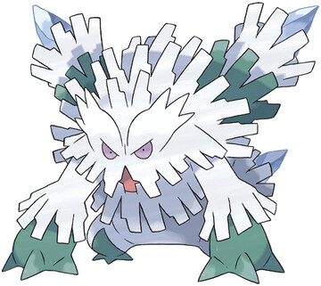
Mega Evolution No. 28: Abomasnow

And at last we come to the end of the officially released Mega Evolutions.

And we get to end it with a bang, Mega Abomasnow looks like every fiber of his body is in the process of getting the hell away from every other fiber of his body.

Seriously though, I love the texture of his "fur" or whatever. It not only makes an easy 3D model, but looks distinctive. Aside from that, he's just a bigger and badder version of Abomasnow. More fur, bigger arms and legs, and also twin pylons of ice or whatever sticking out of his back.

That's cool, to me. They even have a precedent, regular Abomasnow has some trees straight up growing on his back, too. I suppose I'd prefer these columns to be a bit smaller, though, he looks somewhat off-balance when standing upright.

But he's still a ferocious beast, who even gave up some speed so he could put more points into offense. which works great for the guy, because with Avalanche he wants to go second, anyway.


Overall: 9/10

Monday, July 21, 2014

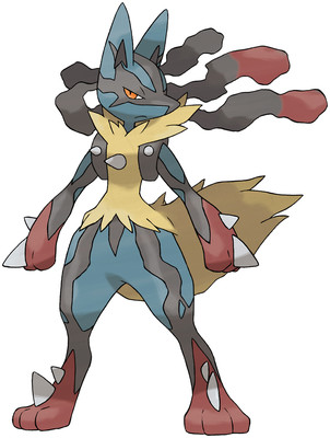
Mega Evolution No. 27: Lucario

I think this might be the first time in a while I've actually gotten the number I was on correct on the first try
are you freaking kidding me


Everyone's favorite jackal-mma-hadouken-dog returns with a Mega form! Which, in this case, means it has odd rust-colored tips to everything, possibly to simulate how it GETS ITS HANDS AND FEET DIRTY WITH THE BLOOD OF ITS ENEMIES but really just looks like it's been playing in shit.

also don't forget even MORE spikes in awkward places. Poor thing looks like it just crashed through a glass window and has shards all stuck in it.

and, naturally, thick black lines just generally going everywhere and making an already complicated design even more visually confusing and noisy.

Just about the only thing I like here is the dreadlocks being all wavy in the wind. Lucario wasn't even that good, yet got pushed hard by Pokemon Company for some reason, so the least you'd think they could do is actually give him a good Mega.


Overall: 3/10

Sunday, July 20, 2014

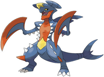
Mega Evolution No. 26: Garchomp

oh, screw me...

Remember how I said Garchomp was kinda cool, but overdesigned and messy? Well, when Gamefreak read that post (and you know they read NAPACE let's be real here) they must have mis-translated it and said that I thought it didn't have enough spikes, blades, or patches of color.

Because christ if they didn't do just that. They took a design that was already ratcheted up to 11 and cranked it up a few more notches. It's at 14 or so right now. They actually had to get a second amp to measure it on, like how when you're counting on your fingers and go above 10 and have to start using toes.

I really don't know where to start with this one. No matter where I look, something inane and unsafe is happening. Garchomp was already a safety hazard, but Mega Garchomp wouldn't be allowed within forty feet of a public building. It has 20 spikes, that's right, 20 of 'em. All along its chest, arms, and legs. Some of them are red! just like it's gigantic hand-scythes.

Don't forget the head, doing its best Battleship Yamato impression, a shark tail sticking out as a weird reminder of what it once was, when the world made sense, and random lines just thrown in for good measure. Oh, and don't worry, it has a splotch of yellow on its belly still. Jesus.

Mega Garchomp is what happens when you give a Godzilla movie an actual budget, it's like two Gigans fused together and mixed up with a Great White Shark and a Piranha. I can't over-exaggerate how crazy this thing is, because it will always be exactly that crazy.


Overall: 14/10

Monday, July 14, 2014

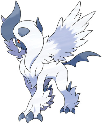
Mega Evolution No. 25: Absol

lookin' pretty scene, Abby.

This would be a case of "you just glued shit to the old Pokemon", except that there's just so MUCH new shit. And most of it looks pretty natural and good.

I dig the hair tufts on the legs, and on the chest. The wings look really soft and feathery, much like the hair. And the tail spike looks like a bat wing or something, contrasting with the angelic wings, which goes back to the Yin/Yang idea. So that all ties together nicely.

the uneven horns and hair over one eye are hella deviantart, though. But I guess that was always sort of Absol's deal. And of course, it's supposed to look like a yingyang or whatever. I can deal with it.

I think this Mega is fairly unique in that it could easily stand on its own, if Absol hadn't existed. It looks like a complete product all to itself. so that's worth something, I guess. I still maintain that anyone who has Absol as their favorite Pokemon invariably has horrible taste in music and boyfriends, but that's besides the point.


Overall: 8/10

Friday, July 11, 2014

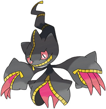
Mega Evolution No. 24: Banette

3spooky5me

Giving me some Soul Eater vibes here, know what I mean? all dem zippers and things coming out of them and shit. I can't decide if they're fingers or tongues, and I'm not sure which distresses me more.

This is a nice evo, actually. Banette always stuck me as being kinda lackluster, so pushing things further works well. It obviously evolved from Banette, and has an interesting club-esque physique.

Prankster is a good ability, too, which makes up for its non-amazing stats. Basically it gets to go first. How it actually works is more complicated than that, but that's the gist of it for all my fellow "non nuclear physicist" types out there.

Again, I like this one so much, and Banette is only a two-stager, I wish it had just been an evolution.


Overall: 9/10

Tuesday, July 8, 2014

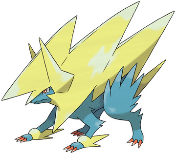
Mega Evolution No. 23: Manectric

oh, for the love of...

No. No, no, no, and NO.

What did Manectric ever do to deserve this, huh? It was a mediocre Pokemon, but now it's got... this. A goddamn freaking lightning bolt with legs. This is like something a four-year old would come up with. a stupid four-year old.

the only positive thing I can say is that it keeps the colors. Otherwise, it's garish and outright ugly. unbalanced, tacky, there aren't really any positive words I can use to describe this one.


Overall: 1/10

Monday, July 7, 2014

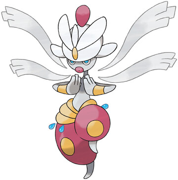
Mega Evolution No. 22: Medicham

we Asura's Wrath now

Okay, first up, I LOVE this design. I'm a big fan of extra arms, as well as floating-but-act-like-they're-attached pieces, turbans, and those puffy pants. Mega Medicham looks like a goofy-yet-badass spellcaster in some Arabic RPG, it's really cool.

But damn if it isn't a Pokemon, right? That shit is crazy busy. Arms and dongles dangling left and right.

At least that's my first reaction. It's very humanoid, but then again, so was Medicham. And it actually retains the same body structure, just added more clothes and those arms. Even the debatable racially insensitive lips are still there! color scheme is also intact, merely added blue.

I think, if the blue beads were gone, and its turbans didn't look like it was trying to fly away, this would be a 10/10 amazing design. And as it is, I like it, but I'm going to have to dock points for looking like a Dragon Quest character.


Overall: 8/10

Saturday, July 5, 2014

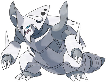
Mega Evolution No. 21: Aggron

yo did this guy just straight-up turn his cap around backwards? that all he did? sheeeeeeit

Aggron dropped his Rock typing, which is interesting. You don't see Pokemon drop a type that often. He also gained Filter, so as to make Super Effective things not so effective. I guess they realized that Rock only served to give the poor guy more weaknesses, huh? and since his Def is so damn high, really it's only special Fire moves that have a chance anymore.

But as for the design, I don't really care for it. A little more spikes, a little more plates, eh. I'm struggling to come up with an opinion on it one way or the other, but I guess it just feels too busy for how simple it ought to be? Like, he's all basically one color. But he's got all these interlocking plates and shit, but I just don't care. My eye gets bored trying to figure out how he works and it gives up, that's the best I can come up with.

I give him credit for being another "this Pokemon needs help, let's help it" case, though.

Overall: 5/10

Friday, July 4, 2014

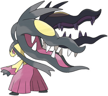
Mega Evolution No. 20: Mawile

two heads are better than one

See, THIS is a prime example of a Pokemon that desperately needed a Mega. Or rather, it needed an evolution. Mawile is such a neat concept, but it's just not that good. Why use it? it's too bizarre and obscure and shit.

So something like this is great. Where do you go? double jaws. Oh, but not just the same damn jaw twice over, we ain't Magneton and Doubledge here. No, these are cool new mandible buddies. mandibuddies. They got all wavy-like lips, and hair and stuff.

I like the pants, because it reinforces the Fairy subtype that mawile got (another great decision) and is actually the same color as the inside of the mouths, so it's not adding a new color the palette. And the pants are like japanese pants and the hair is like samurai ladies have their hair or something I don't know I only watch anime sometimes.

okay that's a lie I watch anime all the time but still

Nothing ruined, design elements kept intact, logical progression, cannot be confused with its previous form, this is great. Only, I'd really rather see it as a proper evolution. We've given those out posthumously before, why not this? But I'm not going to penalize it for being too damn good for just a Mega.


Overall: 10/10

Thursday, July 3, 2014

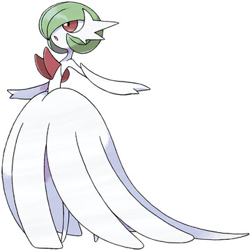
Mega Evolution No. 19: Gardevoir

everybody's favorite waifu returns!

damn, girl, is that a spike in your chest, or are you happy to see me?

but seriously, Gardevoir returns wearing what is obviously supposed to be a wedding dress. Big and billowy, those princess gloves, complete white except for the face and the previously-mentioned spikes.

But I don't know if I really mind that much. Perhaps it's pandering to the pokephiles, but it's certainly not "sexxxy" or anything. Just elegant, which fits with Gardevoir's in-game presentation. and The wing-things on the side of the face are really neat, I like them a lot. that doesn't make me a freak, does it?

also holy crap Pixelate is a good ability. All Normal moves become Fairy, thus get STAB, and get +30%? though looking at the move list, she only learns a handful of Normal damage-dealing Special moves. so maybe it isn't all that powerful an ability.


Overall: 6/10

Monday, June 30, 2014

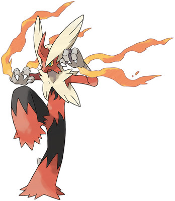
Mega Evolution No. 18: Blaziken

you know who needed a mega?

Me neither, but it probably wasn't Blazekin. Girl was OP already, but just as Goku somehow needed a SSJ4, so too do we have Mega Blazekin.

Anyway, this guy isn't too different in design. burned black replaces the yellow, grows that friggin' unicorn horn that so many Megas just seem to get, and her hair flairs up like wings. none of it remarkable, but none of it offensive.

The flame threads coming out of her wrists, though, are pretty awesome. Blazekin always kind of disappointed me by not having an open flame at all times, so flaming trails on the hands is a good way to make up for that. It's like if she had his hands wrapped with tape like fighters do, but it's coming undone. That's badass. I like it.

the rest is as I said - you have to look carefully to tell what they changed. I think this one could've gotten pushed a little bit more.


Overall: 7/10

Saturday, June 28, 2014

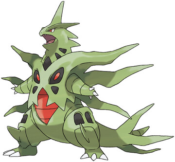
Mega Evolution No. 17: Tyranitar

SKREEEEEEEEEEEEEEEEEONK

So, if Tyranitar is Godzilla, then Mega Tyranitar is like Space Godzilla. or maybe he's that form of Godzilla from when his heart was undergoing a nuclear meltdown and his chest was glowing red and stuff.

Either way, it's extreme. Those spike dealies look impractical as heck, probably make moving around a pain. Actually, looking at his tail, it's like he's peeling. gross.

I dunno, this one isn't too bad, but it isn't too good either. It's just Tyranitar but with more spikes. and angry red. meh.


Overall: 4/10

Friday, June 27, 2014

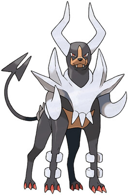
Mega Evolution No. 16: Houndoom

WHO LET THE DOGS OUT? WHO WHO WHO - okay someone kill me please I'm sorry

Houndoom was a bad doggie. Like, we're talking "would eat a baby"-tier evil. The kind of dog that people tell you is so nice, but then you reach down to pet it, and it snaps at your hand, and maybe it doesn't actually bite you, but you can just tell that it wanted to. And Mega Houndoom is even, uh, evil-er.

More spikes, forked tail, bigger horns, sinister glare, we got Satan's own pooch right here.

I like the continuation of his "armor" being like bones, especially the tusks coming out the front. But other than that, it just takes the already established theme and pushes it even further. The musculature itself also looks a bit leaner and meaner, so it's not just new plates on an old dog. or at least it doesn't look like it.


Overall: 8/10

Wednesday, June 25, 2014

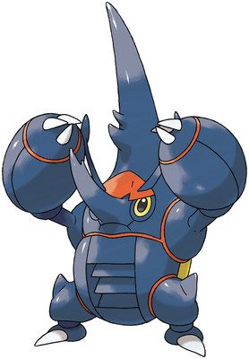
Mega Evolution No. 15: Heracross

the scores are oscillating wildly over here

I mean, what in God's name happened here? Heracross isn't red, not at all. or yellow. I'm displeased.

I also don't like his new horn configuration. THe antenna are awkward and in the way, just cut those out entirely I'd say. But then he's got a funky little nose, and then a SUPER TALL HEAD, is what it looks like. it looks dumb. I know it's closer to what actual rhinoceros beetles look like, but I thought the thing about being a Pokemon is that you can pretend nature is cooler than it actually is?

I would have just kept the frontal , forehead-mounted horn. Megalon-style, yo. ain't nothing wrong with that. The popeye forearms are okay, and according to some pictures I've seen they open up like wings? that's pointless but kind of cool. not cool enough to save this turd, though.

oh, and I hope I don't have to say how stupid that air vent in his stomach looks. because it looks stupid. the air vent in his stomach.


Overall: 3/10

Sunday, June 22, 2014

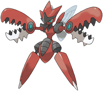
Mega Evolution No. 14: Scizor

Yes. Yes in-frikken-deed

After so many underwhelming Megas, it's about time for something truly badass. Mega Scizor has nightmares on the ends of his arms where his hands should be, and Strike Witches legs for some reason. whatever.

But he gots a cool ninja crest, some more armor bits, in generally just looking like he's deserving the extra Defensive boosts he gets.

But let's get back to those claw/jaw/saw/nightmares we were talking about earlier. Scyther had, well, scythes. just some blades. Scizor stepped it up with claws, but honestly, they didn't look nearly as sharp or dangerous as Scyther's. But Mega Scizor looks like he's packing some serious firepower. Look at those babies, they even have spikes on the underside! why would you even need that BECAUSE IT'S BADASS


Overall: 10/10

Tuesday, June 17, 2014

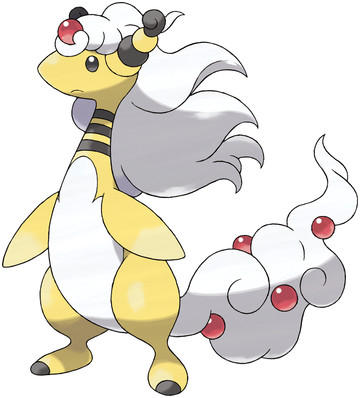
Mega Evolution No. 13: Ampharos

this will never not be hilarious

I mean, not a single bit of it makes a single bit of sense

Ampharos, of all Pokemon
gets a Mega Evolution
where it gains a Dragon sub-type
and grows luxurious flowing hair and nothing else

I guess it's sort of trying to make up for Amphy being all sheered, like I complained about iirc. making it wooly again. But with THAT hair? that Limozeen-brand hair? and the tail that looks like a whipped cream topping with cherries in it?

I want to give it points for being ridiculous, but, that awkward hair on top of that skinny neck, and how it just looks so frigging tacked on, like a bad sprite edit - I'm sorry, I just can't take it remotely seriously, or think it looks good on any objective level. Like Steven Tyler.

and this was one of the first ones they showed, too. Like they were so damn proud of this concept, THIS is what they wanted to represent this new idea of "Mega Evolution".

I don't know if I'll ever stop laughing.


Overall: 1/10


Thursday, June 12, 2014

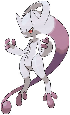
Mega Evolution No. 12: Mewtwo Y

Design by Gamefreak, Beats by Dre.

So if Mewtwo is Freiza, and Mega Mewtwo X is Super Buu, then that makes Mega Mewtwo Y Kid Buu, right?

alright, so, this one is kinda radical. tail is now a head-tail, and his neck tube whatever is now the bridge of his headphones? I can dig it, I suppose. that chest ridge looks kind of dumb, like they just threw a line there because they got scared of blank space.

I like the fingers and toes being different colored, always love that shit. and I think the concept works well, it's like how Buu and Frieza got their most powerful by slimming down and stuff. I actually had an idea for an evolutionary line that works like that, only gets stronger but gets less and less physically intimidating.

so yeah. This was one of the first Megas announced, and a lot of people had kneejerk reactions, but I think I actually like it more than a bit.


Overall: 7/10

Wednesday, June 11, 2014

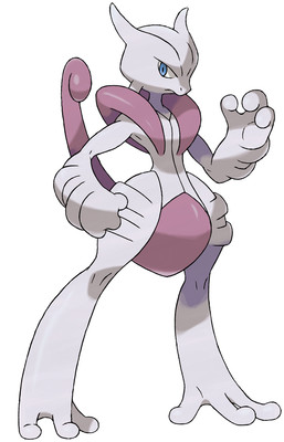
Mega Evolution No. 11: Mewtwo X

Finals hit me really hard, and E3 hit me even harder. But I want to get back in the saddle now.

Mewtwo really didn't need to get any stronger, but I guess here we are. He picks up a Fighting sub-type, which is kind of cool, and looks like he lost that pear-shaped physique, so he's ready to tear it up.

I don't know, this one doesn't look too bad to me. I'm not sure I see the point exactly, but I'm going to wear out my keyboard if I have to type that every single Mega Evolution I review.

Design is well-proportioned, relatively sane, and keeps key elements like the crotch-tail, balls on his toes, and head shape, but looks more like an alternate forme than a step up. Like if Deoxys has Attack Form, this is Mewtwo's Attack Form.


Overall: 5/10