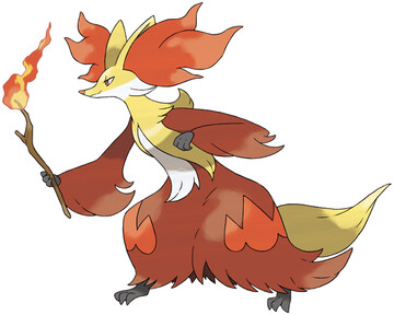
look at Gandalph the Red here, off to lead a band of hairy dwarves through some caves.
I don't care for it. first off, full robes are often stupid. and this is one of those times. secondly, wands are often stupid. a staff is what a true wizard uses, or just conjure with your hands. wands are for Hogwarts losers.
I miss the broomstick theme that was coming along, and also the ear hair is just insane and looks really really silly when I think about it for more than 2 seconds.
It's a good typing, in fact all of these starters end up with good typings, but I just think the design looks so... lame. like the most uncool mage wizard they could think of.
Overall: 3/10

instead of mage, think of it as one of those fox people from muramasa (which I'm sure both this and that were inspired by the same japanese folklore stuff). It makes it look better for me, at least.
ReplyDeleteYou ever notice that ,until Fennekin's line, fire starter lines got more and more angry as they evolved? Though, the trend with bipedalism still goes on.
ReplyDeleteYou didn't point out that from the front it looks like a giant wizard hat?
ReplyDeleteit really doesn't, though. the two ears make a cleft in the middle, and the hair tufts make like 3 brims on each side.
Deletethat's one messed up Wizard hat
Seven things that would make Delphox better;
ReplyDelete1) Seriously downsize the hair coming out of its ears. By far the worst thing about it, it looked cute on Fennekin, really goofy on braixen and flat out awful on Delphox
2) The stick should have been replaced with a staff or scepter that is carried with two hands and is something Delphox crafted itself. While I agree that normal wands are low-level mage shit, really strong magicians in many stories often carry their own staffs that are specially enchanted and are combined with some fantastic element/item
3) Remove that piece of fur arching up on its back
4) Get rid of the tail, it only looks excessive on the big robe-like fur
5) Get rid of the two flames on the robe
6) Let the fur also cover its feet, they are tiny and awkward looking
7) Give the arms the same color of the head
six and seven are debatable, but every other change would have at improved the design, without adding any unnecessary shit
I mean chesnaught is fundamentally a mess, but this guy actually had a chance at looking decent.
Well, at least there is one good starter with Greninja, so I guess that's an improvement over the 5th gen that only had garbage?