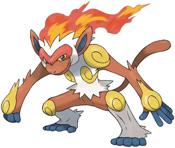
Well, you've got one, you sick son of a bitch. Are you happy now? Two Fire/Fighting starters in a row, that's a one too many. I mean, it's still a strong combination, but I'd like to see some other typing. Like Grass/Ground on Torterra, that's unique. Or what Empoleon will be bringing to the table. I guess I don't honestly thing a flaming monkey shouldn't be Fire/Fighting, I just think maybe they should've tried for a different theme?
As for Infernape himself, well, he's got a lot going on. Red, white, blue, yellow, and brown. That's like, twice as many colors as a good, simple design should have. On the other hand, his "Journey to the West"-inspired design is cool, and the flames just coming out of his head is a nice touch.
But you know what? That isn't a good Pokemon design, it's a good Digimon design. This is Flamemonkeymon, right here. Again, a problem a lot of 4th Gen Pokemon have. They don't look like animals anymore, they look like battle animal demon spirits and stuff. I don't know, maybe the definition of "what a Pokemon should look like" has changed over the years, but for me, I like the aesthetic of the early generations the best. So, since it's my goddamn blog, I'm going to judge the hell out of these guys.
Infernape, you are cool, but holy SHIT your design is busier than a one-legged man in an ass-kicking contest.
Overall: 7/10

Druddigon also reminds me of a Digimon.
ReplyDeleteThis is where I totally disagree. It's the case were everyone else thinks "It came second, so it's worse than the first." when while i liked Blaziken when 3rd gen was new, I think Infernape and Emboar blow it out of the water.
ReplyDeleteAlso the design is based off Sun Wukong, which is awesome, and the reason for it's "busy" design.
Well i'll have to say i liked Blaziken more, but Infernape is pretty ok imo. But it's still my least favorite 4th gen starter.
ReplyDeleteI actually think blaziken looks way more like a digimon than this guy does
ReplyDelete