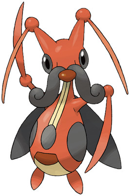
What a random, messy design. It has antennae that looks like its arms, an awkwardly placed nose and mustache (which used to be antennae?) a bunch of things going on with its pattern that I don't care about, and and overall body shape of a gourd.
Bugs shouldn't look like gourds.
Also, it has a needlessly terrifying cry.
Seriously, Kricketune just looks lame. I kind of want a bug with a mustache to be awesome, but I just can't bring myself to pretend Kricketune is anything but a mess.
Overall: 2/10

but...but...it looks like a violin
ReplyDeleteDisagree 100%. As the last person said you seemed to have missed the point of the design altogether thanks to your "4TH GEN IS MESSY" mindset.
ReplyDeleteAlso on the subject of Crickets not being red, well if it was green you would just say "too many green bug types".
Also the cry is awesome. My favorite cry period.
He never said that the red was a bad color. It doesn't really help the design out, but having a red cricket isn't why it's bad.
ReplyDeleteI only noticed the "violin" resemblance when you mentioned it... the design's way to messy to make that distinction very easily. The body looks way to much like a gourd to make me think "violin". The only resemblances I see are the strings and the C-curves. Then the head, wings, mustache, and antennae-scythe-arms completely destroyed it.
Maybe if the wings were the coattails of a suit jacket. Or the arms looked more like a violin bow. Or the head got rid of the arms and had a shape that looked like a screw box and screws that are actually ON a violin.
I'm sad, I love violins. And the terribly design just makes me hate this guy even more.
Let's go back to my three step process for a good pokemon: take a real animal, make it different, add something badass.
ReplyDeletethey took a cricket (then forgot any identifying traits crickets have), gave it a red almost-vest-like pattern (fine I guess), and then added a dopey hipster mustache and flimsy looking claw hands (not badass at all).
I will say the cry is unique, though. One of the few I can immediately tell what Pokemon it is. That's where the positive points are coming from.
I know this is an ancient comment but, this line was actually supposed to be a violin beetle, and we now know why it got named as a cricket Pokemon - because the artists who design the Pokemon actually don't get to write the dex entries or their names at all. There's like no communication between those.
Delete(Anon #2) First of all, I'm not saying you're wrong, because everyone has different tastes, but really I just think you have it in your minds that it has to suck because it's 4th gen.
ReplyDeleteLike this bit: "Maybe if the wings were the coattails of a suit jacket. Or the arms looked more like a violin bow." They DO. I noticed those things right away when I first saw the thing.
And I know it's rude to say, but I can't help thinking that no matter what changes they could have made you would just think "it's messy". Would making the tails longer and adding strings to the bows really make it better or just more messy?
Oh and another thing I forgot to mention about Kricketot, the antennae also look like big hairy eyebrows, which becomes a big hairy mustache.
"...They DO. I noticed those things right away when I first saw the thing..."
ReplyDeleteNot really, the wings and arms look KIND OF like coattails and bows, but not enough for me to like it. The resemblance is vague and needs to be more prominent.
Maybe if they illustrated the bows with color. Instead of solid-red, make it different. Have a dark-red along the outside, a white space in the middle, and a black line along the edge. Or just the dark-red outside and a light-red inside. Make it look like it has a handle and strings, rather than just a blade-shape.
And the wings look nothing like coattails besides the color and there're two of them. Coattails don't spread out at the shoulder, the jacket goes down to the waist, then the coattails fall down after that. And they're usually square.
P.S. I try my best to avoid the "4th generation, therefore it sucks" mentality. I actually tried to like this guy, merging a cricket with a violin is an awesome idea. I just don't like how they did it.
Deletehey it's anonymous 1. Not taking sides cuz I don't really even care about this one, but I would like to mention that the sprite moves his claws back and forth over his "strings". IMO that made it apparent to me but whatevs peace........I wouldn't doubt that this entry has the most comments
ReplyDeleteDELELELELELELELEWOOOOOOOOOOOOOOOOOOOOOOOOOOOOOOP
ReplyDeleteThe reason it doesn't look like a cricket anymore is because it's actually based off a Violin Beetle.
ReplyDelete