Tuesday, July 31, 2012

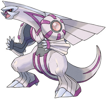
No. 484: Palkia

If you decide which game to buy based on mascot Legendarys, then boy, 4th gen must've been tough for you. Because there is no winner.


Palkia is based off a pearl, which is a much lamer stone than a diamond. And it's pink. On the other hand, it has a much more dragon-like frame, which could be neat. But on the other other hand, it still looks like a guy in a suit, ready to fight Ultraman or something. And also its backsprite looks like, for want of a better word, a penis.


Besides all that, it's bizarrely a Water/Dragon type. Why water? What does ANYTHING about Palkia have to do with Water? You know what would have been a good typing? Cosmic, bitches. Dragon/Cosmis, right there. Boom. Make it happen.

Another thought - it controls "space", right? What does that mean? It controls the physical dimensions, as in it can alter something's height, length, width? Or does it mean it can warp shit around. Because if it's supposedly eternal rivals with Dialga (why? because Time and Space are obviously rivals instead of being two equally necessary mechanics of nature), it'll need more oomph than just teleporting, to beat time shenanigans.


Overall: 4/10

Monday, July 30, 2012

No. 483: Dialga

I'm sorry, Dialga, and I'mma let you finish, but DIO had the best time-manipulation powers of all time, baby. Of all time.


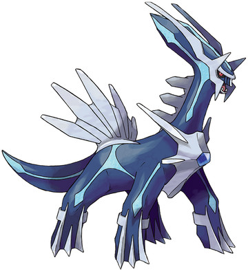
Especially considering you look like something from one of the recent Godzilla movies. I can almost smell the latex, and the sweat of the two poor men tasked with making your legs move in some sort of believable fashion.

I guess if they were going for "unearthly, nearly-synthetic, sci-fi, techno beast", they got it. But it doesn't look much like a Pokemon anymore. Too many flanges, and it also raises some rather unsettling issues.

For instance, Dialga supposedly governs Time. Or at least has full control over it. (never mind that temporal shenagins was supposed to be Celebi's arena) Now, I'm guessing there's only ONE Dialga? Because I always thought Legendarys were solo affairs, but apparently according to the anime there are multiple Articunos, for example. But I think there's only one Dialga, one primordial entity.

And then you can just kinda catch this entity? How do you catch a thing that can rewind time? And once you do, doesn't that upset things? Or how intelligent is Dialga? Maybe it's a wild beast, that has more power than it should, and is a force of danger and chaos that needs to be reigned in. In any case, these are issues much more complex than ought to be in Pokemon, methinks. I think the themes ought to be limited to "poaching is bad", "be nice to your pets", and "try your best".

So yeah, Dialga - you belong as a late-game boss in a more serious JRPG, not Pokemon.


Overall: 4/10

Sunday, July 29, 2012

No. 482: Azelf

uuuuuuuuuuuurrrrrrrrrrrrhhhhhhhhhhhggggggggg


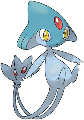
At this point, I think I'm beyond caring. All I want to say is that I actually like Azelf's head, because it reminds me of Princess Ruto, from Ocarina of Time. And if this was no legendary, just some Water/Psychic type or something, I would give it a pretty good score. It looks like the beginnings of some squid-fairy thing. So that potential raises it up past its brethren, but that's like picking the very prettiest lungfish.

Also I'm still mad at Uxie. That is the worst name. It sounds like a fairy throwing up.


Overall: 2/10

Saturday, July 28, 2012

No. 481: Mespirit

holy shit what is this asswipe


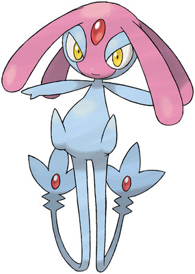
look at this smug bitch, thinking she's fine and all. No, Azelf, you're not fine. You're stupid and horrible. My opinion on you is exactly the same as it was on Uxie (possibly because you are the same damn thing) IRREDEEMABLE GUTTER TRASH.

See, for a Trio to work, there needs to be two things: something connecting the trio together, and something that differentiates them from each other. These wet farts have the "something in common" part in spades, but they fail completely in being different, or even important. I shouldn't have to say it all again, goddammit.

I just think it's almost insulting how similar they all are. I know their stats are different, but screw me in the belly button and call me Betsy, that doesn't matter a bit when the typing is exactly the same, and 80% of the body looks the same.

Also for some reason this Pokemon governs over emotions, or willpower, or something else like that, but as you can probably tell by now, I don't fucking care.


Overall: 1/10

Thursday, July 26, 2012

No. 480: Uxie

We're entering the homestretch, guys.


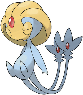
But before we're done, we have to get through the legendarys, which for the most part suck majorly in the 4th gen. For example, take this pukester: Uxie looks like a Mew with fetal alcohol syndrome. And if that sounds unreasonably harsh, it's because I mean it.

Uxie and its compatriots are just pure wastes of space. Because you know what we really need? More tinycute Psychic-type legendaries! And hey, everyone loves trios, right? So let's make three! All the same typing! And nearly the same design! And maybe after that we'll be dragged out into the street and shot! Because our ideas are goddamn terrible!

I hope you like reading angry writing, because that's all you're gonna be getting from me on the topic of these guys.


Overall: 1/10

Wednesday, July 25, 2012

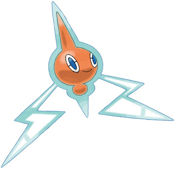
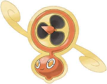
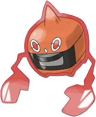
No. 479: Rotom

Does this one count as a legendary? I dunno.


Ghost/Electric is a neat typing, and I like how you find it - hiding in a possessed TV. Rotom by itself looks cute, and shows a lot of promise. Then he startles you by turning into household appliances and shit. 

Normal Form: 7/10


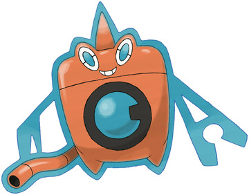
Washing machines are not scary or cool, and why is his aura turning into a protractor or something? is that a claw? Gooey webbings stuck to his tube? dumb.

Wash: 2/10


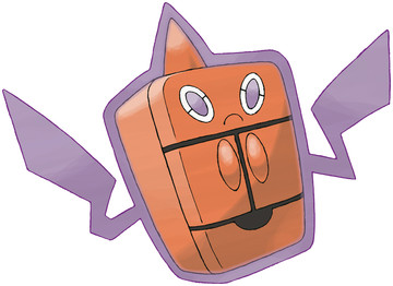
Unlike William "The Refrigetator" Perry, this form doesn't look like he would be of much use on the gridiron. He reminds me of that one Ice/Spark combo in Kirby 64, tho, where you turned into a fridge and spit food out. That power kicked ass. This guy doesn't.

Frost: 3/10


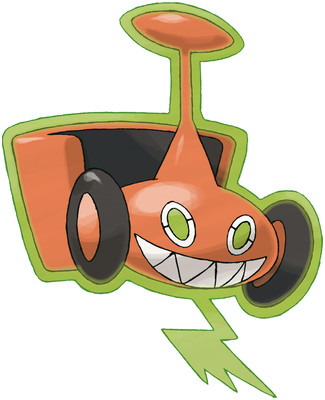
Is a lawnmower even actually a household appliance? In any case, I kind of love the maniacal grin, and the sheer audacity of it. "yeah, it's a killer lawnmower. why? screw you, that's why".

Mow: 8/10


In Korea, there's a superstition that leaving a fan on overnight can kill you. But I don't see how you could be afraid of this lil fella, he's adorable. and I like how his aura is all swirly, like wisps of wind.

Fan: 6/10


I sincerely hope that this form shoots fire from its grill, and punches with its hands. That would be great. I don't know what it would do otherwise, but if it does anything else I'll scream.

Heat: 7/10


I'll average and round up, because it's a unique concept. Rotom would be a shitty legendary, but I don't think it classifies itself that way, it's just a strange kinda-neat gimmick Pokemon you get in the post-game.

Overall: 6/10

Monday, July 23, 2012

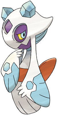
No. 478: Froslass

dat froslass


I spooked myself when I first realized Froslassis just an orb with dangling appendages, rather than a tiny woman in a kimono as she appears. I guess that's where the Ghost-type comes from, unless it comes from another bullshit nonsensical Japanese folklore story, in which case I don't care so hard I'm practically shitting rocks.

So, yeah. Snorunt never made any damn sense, but at least Glalie was a pissed-off ball of ice, which I can relate to. So I'm not really surprised when there's a split evolution, for it to turn into some sort of Yuki-onna looking freak. It doesn't look a bit like Snorunt, nor Glalie, but that's par for the course in this messed-up evolutionary line. And I admit the color choices look nice, but it wouldn't have been too hard to make it white and black, like Glalie, would it?

eh, Froslass is alright. It's certainly an ambitiously unique typing, and like I said, the way the head is actually the core is pretty clever. I just don't know why it had to be attached to Snorunt, but then again I've long ago given up on understanding anything about that guy.


Overall: 6/10

Sunday, July 22, 2012

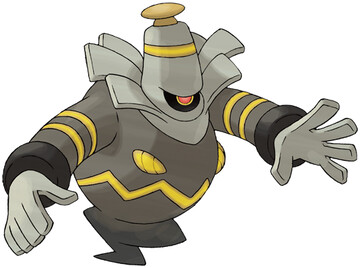
No. 477: Dusknoir

This time it's personal.


I loved Duskull, and then Dusclops came along and was kind of a disappointment, and now Dusknoir is like a character assassination on the whole thing.

The most glaring flaw is the lack of any actual skull anywhere on the thing. Sure, it's got some sort of face on its stomach, but that looks like a charlie brown stripe and glowing nipples. The cool thing about the Dusk___ line was how the skull stays the same, but the ghost fills out behind it. Now Dusknoir is wearing some sort of stupid little hat that belongs in Rice Boy or something (nothing against the webcomic, you should all go read it).

Then there's the color scheme. Dark gray, grey, and yellow. Oh, and a brown knob on top because why-the-hell-not. And don't forget the bands on the arms, because holy-shit-how-do-I-into-character-design-hurp-hurp-derp. My amnesia might be acting up again, but weren't Duskull and Dusclops just brown, white, and a red eye? Did they have yellow bands all over the goddamn place? Did they have a ridiculous collar? I don't frigging think so.

How hard is it, Gamefreak, to stick to a theme? Why do you hate all your previous designs enough that you want to radically change them? If you want to make a sassy fat genie Pokemon, then make one. Don't force it into an established line. And it's really sad, because I think a final form for Duskull would be badass, something imposing and sepulchral. Instead we got Robin Williams in a fat suit playing the fat guy in A Merchant of Venice. And don't nobody tell me there isn't such a character, I'll kick your teeth in.


Overall: 1/10

Saturday, July 21, 2012

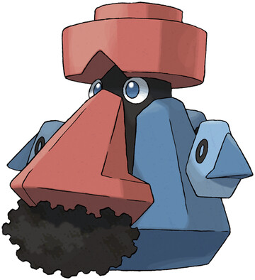
No. 476: Probopass

this year's winner of Least Anticipated Evolution: It's Probopass!

I feel like I ought to be offended my this, somehow. I'm sure Probopass is offensive to someone, I'm just not sure who. Maybe it's an ethnicity that hasn't been invented yet, but when they appear, they'll definitely be pissed about this.

Anyway, I just realized that Probopass has tiny Nosepasses hanging on it. I think they're supposed to be the other cardinal directions, and the giant red nose points North, but it's kind of blowing my mind. I totally thought they were arms and a tail and such until I saw the picture big right now. In fact, between this revelation and the possible racism, I don't think I can't think about Probopass one second more. I'm going to end this short and sweet:

Probopass is a bigger, uglier Nosepass, who was already only mediocre.


Overall: 4/10

Friday, July 20, 2012

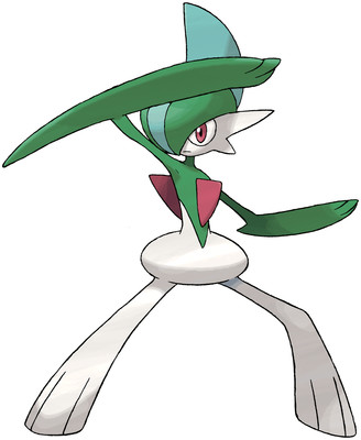
No. 475: Gallade

Shoutouts to all the male Gardevoir from Hoenn who grew up in a region that wasn't so heteronormative.


I support making a male and female evolutionary split, but I think Gallade is a bad example. To start off with, he's got one giant arm and one normal one. That's some Digimon-level asymmetry right there. You're not even a fiddler crab, Gallade. Why is one arm so damn big.

The next thing I notice is his hips, which make him look like he's trying to pass a kidney stone the side of a football. Or maybe he just has donut hips, like the titular character in the Amazing World of Gumball. In either case, it's lame and dumb.

Finally, his head crest. Seems cool in theory, but why's it blue? And a shade of blue so similar to the green? Should've been red, like the crests in Kirlia's hair. And then the chest spike would've been optional. Someone sent me a picture of Gallade with normal person hips, both elbows spiked, and something different with his crest that I don't quite recall, and it looks much improved. Almost badass, I'd say. The pants look kinda like those pants samurai wear, something could be made of those.

But in the state he's in now, Gallade is an awkward abomination, the kind of Pokemon that tries to look cool but trips over his own mutant elbow because of his deformed hips.


Overall: 2/10

Thursday, July 19, 2012

Someone stole all the Pokemon!!


As some of you may have noticed, all the images for Pokemon before Swampert are now dead links. I guess Bulbapedia moved around things or something? So I want to go back and re-link all of them, so that new people coming to NAPACE don't get confused because they can't see what I'm writing about back then.

However, is copying the url directly from the main entry page on Bulbapedia really the best option? Does anyone have another idea that might be more secure?

Also, as long as I'm going to be going over each one again, I was thinking of tagging each one by type, as well. Would that matter to people? Would you want to be able to see, at a glance, which Grass Pokemon are sucky poops, and which are glorious triumphs? because if that don't matter I won't waste my time.

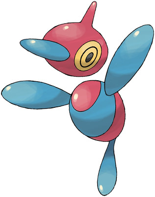
No. 474: Porygon-Z

DISC READ ERROR: THIS POKEMON IS SHITTY. PRESS ANY KEY TO CONTINUE


The original Porygon was like N64 graphics. Porygon2 was like Gamecube graphics. Porygon-Z is like... something? I've heard people say its like it got a virus and shit, but that's pretty stupid if you ask me. How is that an evolution, an improvement? an alternate evolution path from Porygon, resulting in a guy whose vertices are all out of order and his planes aren't drawing properly, collision glitches everywhere, that would be freaking awesome.

But I don't see that here. Porygon-Z looks like Porygon2 just got up and started waving his arms in the air (like he just don't care). And what's the Z for, "Zounds, this Pokemon is stupid"?

Again, I have to ask why this even exists. Wouldn't the next logical step be for a Porygon3D, that somehow is even more 3D than it already is? Wait, that sounds stupid also. I like my alternate-path idea, and I also like the idea of leaving Porygon the hell alone. Just like the virus I got that crashed my computer a few years ago, no one asked for Porygon-Z. Only one question remains - When will Porygon GT come out?


Overall: 2/10

Wednesday, July 18, 2012

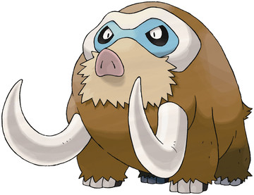
No. 472: Mamoswine

Apparently old-timey people saw mammoth skulls and thought they were cyclops heads. What a bunch of cretins!


Mamoswin looks naked to me. It's missing the shaggy fur so characteristic of its line, and the lack of a trunk makes it seem unbalanced with those huge tusks. Where are they even coming out from, anyway?? I don't see and lip lines, and they're too low to be obscured by the 'stache. In fact, that one on the left looks like its coming out of the armpit.

Also, what's up with its face? Why does it have baboon-like color wings around its eyes? Seems like a strange choice. I think they were trying to make it look like it has ski goggles on, but I'm not buying it. Especially since, like I said before, I expect not to see the eyes much at all. Where's the shaggy, baggy fur?

I want to like Mamoswine, because his typing rocks my socks and woolly mammoths kick ass, but he turned out more like a mammoth with its head and neck amputated, a Mr. Potato head face stuck on the stump, and the tusks wedged into its armpits.


Overall: 3/10

Tuesday, July 17, 2012

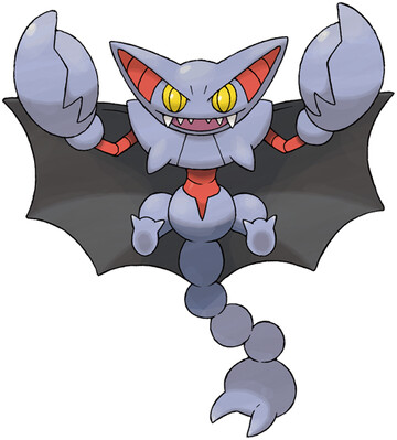
No. 472: Gliscor

Bleh! Bleh!!


Gligar is crazy, and I still think he should've been Poison/Flying instead of Ground/Flying, but whatever. Gliscor here could be Poison/Dark and I wouldn't bat an eye, but he retains the increasingly improbable typing.

Anyway, the first thing that hits me is how they changed the magenta and navy blue color scheme for purple, black, and red. The red is especially off-putting. I'm also not a fan of the claw-tail, because despite Gamefreak's love of the appendage, I prefer regular nasty looking hooked stingers. The rest of Gliscor is a pretty natural evolution, I guess, bigger claws, ears, etc, but I can't help but feel that it all seems unnecessary.

Wasn't cute lil' Gligar enough? Were people really clambering for a follow-up? This is the question I ask most of the Afterthough 18, but for some reason it sticks out especially at Gliscor. It's probably the fact that he doesn't add anything conceptually new into the mix, and messes with the color scheme when there was no need.


Overall: 5/10

Monday, July 16, 2012

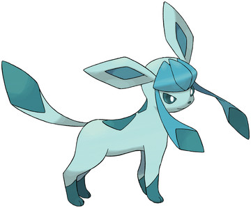
No. 471: Glaceon

Let's get this straight: on a human girl, bangs like this with long side-hair things like that is a major turn-on.


I like Glaceon's diamond motif, and the varying shades of blue work well. It's an Ice type, but doesn't have literal chunks of ice on it, like the rest of the Eeveelutions (baring Leafeon), just kind of a suggestion of frozen-ness.

Also, is it just me, or does Glaceon have a kind of endearing facial expression? It's got its eyes narrowed and focuses, and a tiny smile. Overall, the design is actually pretty good, and not at all what I would have done if you had tasked me with making an Ice-eevee. I probably would've given it lots of fur trim, and a parka almost, and then I would've shat all over my own design in review for looking too much like a blue Flareon or Jolteon.

I still don't see why Glaceon had to be, even less so than Leafeon. We've already got a blue one, and in fact just adding a single Eeveelution so that you can have a full team of 6 of them would be fine. But, alas, here we are. And here we will be, as we trudge through the rest of the Afterthought 18, and then hit the Legendarys. Of which there are a lot, half of them related to Manaphy as I recall.


Overall: 7/10

Saturday, July 14, 2012

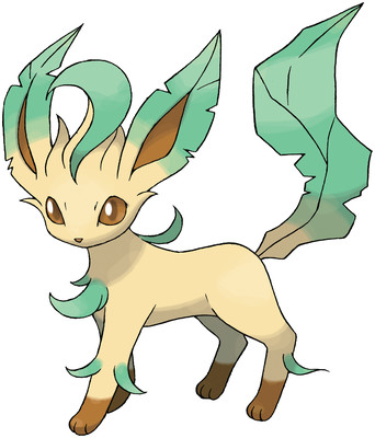
No. 470: Leafeon

Let's get this straight: "Leafeon" is a really, really uncreative name for a pokemon.


I mean, it's almost as bad as some of the later Digimon, where they would literally just write a one-sentence summary of the monster, and then add the suffix "-mon". see: DarkMetalWarGreymon, RedSkullMeramon, etc. Because couldn't they come up with a better word that relates to the Grass-type, and flows with the ___eon style better? Herbeon? Bulbeon? Cloveon (clover-themed)? Thorneon (rose-themed)? I admit that none of these names really fit the design, and a new one would have to be created, but...

maybe that's kind of the point? Leafeon looks like they were really reaching for eeveelutions at this point. They just have a generic mammal body, with ears turning into leaves, and a leaf tail. Oh, and green whatevers sprouting off. It's pretty lame, compared to any of the other Eevee designs, and I wonder why it even had to happen. Wasn't a full team of 6 Eevees (one of each evolution and the normal one) enough? Now it's impossible to have all the Eeveelutions on a single team.

Oh, to digress: it bugs me a bit that the starter trio is Grass-Water(or sometimes ice)-Fire, and that's a common trio. Yet Electric-Fire-Water is also a major trio (original Eeveelutions, legendary birds, legendary dogs, tri attack, etc). There's a lot of overlap there, isn't there? Do they really both need to be established things? What about making more established trios? I don't even know if I'm complaining about anything here, I'm just saying random things. I think my point is that no one can say "Well they had to to a Grass eeveelution, they had a Fire and Water one" because there's no precedent for that sort of thing really.

um, returning to point - Leafeon is just so awfully generic and straight-from-someone's-deviantart, yet I think it could've worked, if only they actually went in a direction with it instead of just boringness.


Overall: 4/10

Thursday, July 12, 2012

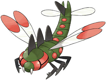
No. 469: Yanmega

Remember Yanma? "Actually just a dragonfly" Yanma?


Well meet "Still just a dragonfly" Yanmega!

I guess now it has more spots all over it, and flat spikes, but honestly, it really isn't looking too threatening. I might have said this before (on Yanma's post) but I would like to see something like those flying flat centipede things in Nausicaa. That would be scary and cool, instead of literally a giant dragonfly with not much added at all. There's not much more for me to say, because it should be pretty obvious why Yanmega sucks.

I just really wish there were more top-class Bug Pokemon, instead of lame duds like this one.


Overall: 2/10

Tuesday, July 10, 2012

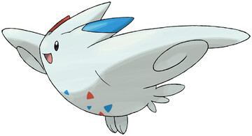
No. 468: Togekiss

Okay so I lost a tournament to a Togekiss using Thunder Wave once so I'm salty as hell about this Pokemon


But ignoring that, I think I can still find reasons to hate it.

1. Normal/Flying
2. I have never given a damn about the Togepi line and don't see why it needs a third step
3. ridiculous tiny little feet
4. aren't the red and blue triangles supposed to be outlines, not solid chunks?
5. Normal/Flying
6. that face is hilariously small compared to the rest of the body
7. it looks like an airplane but with no nosecone or tail
8. did I mention it's a Normal/Flying type?

[edit: With hindsight, three of these points are irrelevant. However, I don't like Fairy Types as a rule either, so the overall thrust of my argument still stands.]

Though even with all that, I suppose it isn't outright offensively horrible, just really pointless.


Overall: 3/10

Monday, July 9, 2012

No. 467: Magmortar

Also known as Booburn in Japan, which is just about the silliest name I ever heard of.
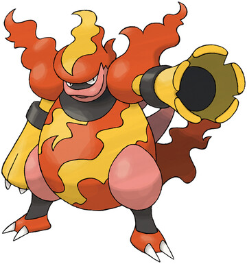
Okay, note to Gamefreak: stop making new evolutions that are just fat versions of existing Pokemon. That doesn't count as originality, it's just depressing and dumb. I know Magmar was a portly little son of a bitch, but Magmortar looks like he has a beer gut large enough to run for office in Missouri, and the maneuverability of a jelly donut.

Before I really lay into him, let me first give credit where credit is due: arms that are mortar cannons is badassed no matter what. So there's that.

But besides that, it's all fairly odious. The pink is especially distracting - why can't he just have regular red thighs, and orange lips? Or is it a beak, it used to be a beak. Why isn't it a beak? And where'd the legitimate tail go to? Instead we have a flupple whup of a tail.

Another major problem I have is the "flames". His head is on fire, his shoulders are on fire, and his tail is fire. But none of it looks real, it all looks like the fleshy protrusions that sea slugs and nudebrachs have. Which reminds me of a slightly related grievance I have: whenever 3D models of Pokemon are tasked with doing something that doesn't look like it's made of out steel, plastic, or latex, they often fall short. Especially with flames. In Pokemon Battle Revolution, Magmortar's "flames" don't flicker, they just jiggle and wiggle with a cursory particle effect that looks like it came straight out of Runescape 1.0.

It bugs the shit out of me, because it shouldn't be that hard, and yet for some reason it is. Doing non-shitty fur is also a problem apparently, because when I look at Flareon, I don't see something I could snuggle up to, I see a spiky plastic thing. And the rock Pokemon? Plastic McDonalds' toys. It's awful, and I hate it almost as much as the fact that you can't just pick any old team, you HAVE to use a pre-made one. What if I want to make a team of Diglett, Mewtwo, and four Eeveelutions??

Anyway, I went off on a tangent there, but seriously, screw all that crap. Also screw Magmortar, because I'm not letting the big red egg off yet. I don't like the fire design winding its way around his body, and I want to again stress how offensive his lips look. There were many things a Magmar evolution could have been, but "obese semi-racist easter egg with fleshy wigglers" was not one I expected. But I still like the cannon arms.


Overall: 2/10
Saturday, July 7, 2012

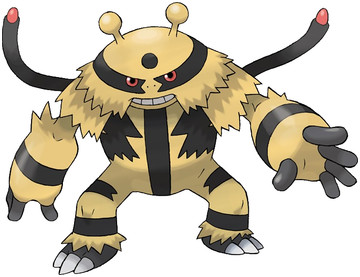
No. 466: Electivire

Doesn't Electivire's head look a little bit like a flying saucer, too?


At first Electabuzz was just a cool one-stage Pokemon. Then he got a prevo in the form of Elekid, and now he gets a final evolution with Electivire. I think this is one of the few members of the Afterthought 18 that really needed to happen, you know? There aren't very many 3-stage Electric Pokemon, so the big alien ape is welcome in that regard.

But let's talk design. Bands everywhere, random dots of color, but you know what? Electabuzz has always had stripes, no no foul there. The thing that gets me is those twin tails with the red tips. I think they're supposed to be wires, but I don't like them. I also think the electrical plug design on his back is stupid. Like, do Elekid plug into there? That's messed up.

Electabuzz has always reminded me of a gorilla with tiger stripes and a tail, so I'm a little sad to see the tail gone in favor of the more bizarre tentacle wire things with LEDs on the tip. When people say "all these new Pokemon look like aliens" and I look at Electivire, I see what they mean.

so, a fairly good Pokemon that deserves to exist, with a few strange bits against him. In the last quarter of the 4th gen, that's actually pretty damn good.


Overall: 8/10

Friday, July 6, 2012

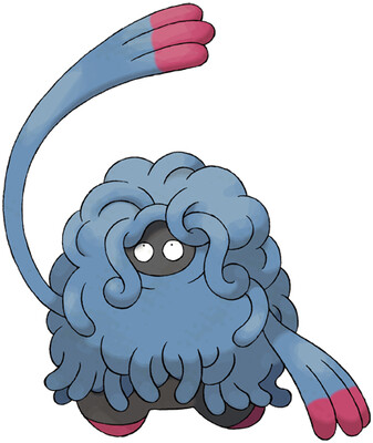
No. 465: Tangrowth

Remember that one time in Toriko when that GT Robo summoned Tangrowth to fight Sani? Was the previous sentence just pure gibberish to you? If the answer to either question was "yes" then you should read my blog every day.


Most of the Afterthought 18 are exactly that - afterthoughts, additional evolutions to Pokemon that no one really asked for. So in this regard Tangrowth comes out of friggin' nowhere, but actually I'm kinda glad it showed up.

See, Tangela is unremarkable and strangely forgettable, for how unique it looks. It was a ball of blue pasta on shoes. But Tangrowth... it has pretty great stats, and is just so bizarre and in-your-face that you can't ignore it. Why is it blue? What lurks beneath those vine-tentacles? Are its fingertips really red, or stained with the blood of its enemies? An enigma, that's what Tangrowth is.

Seriously, it takes the concept far enough to be noticeable, and that's what makes it better. I think it's kinda strange to be a pure Grass-type, and yet blue, but whatever. The arms are what really sell it, though, because it looks like it would whip your shit with them.

Just - just be careful you don't get caught up in all those filthy, naughty tentacles. Because if there's anything Tangrowth does better than fondling, I don't want to see it.


Overall: 7/10

Thursday, July 5, 2012

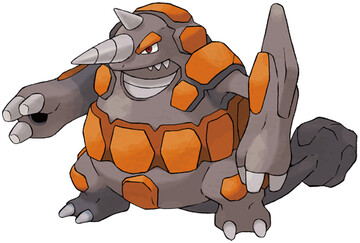
No. 464: Rhyperior

It's good to be back! A big shout-out to any Spanish, British, Canadian, and German readers out there - I was in your countries recently! It was nice!


But now the niceties must end, as we confront this unpardonable wreck. Rhyperior is just so freaking terrible, I barely know where to begin.

Let's start with the color scheme. Orange-red, and dark grey. Now, correct me if I'm wrong (I'm not), but aren't Rhyhorn and Rhydon both light grey and regular grey? With nary a hint of orange anywhere? Why is this guy suddenly all reddish, he's the same damn type as them! And the three of them look awful put next to eachother, Rhyperior looks out of place like a pineapple in a basket of midgets.

Now, let's talk about the shift in design away from plate-armor, to jumbly bumbly rocks. Because it's wrong. Or how about the stupid lumpy rock hot glued to the end of his tail, or the way his elbows extend to ridiculous lengths. Oh, and also those orifices in his palms? He inserts rocks up in there, and then shoots them out. That would be cool, except additional orifices in the body make me extremely ;uncomfortable. and also, why can't he just shoot his own damn rocks?? He needs to load up ammo? Blastoise doesn't have to reload.

Rhyperior is yet another case of a redundant evolution that missed the point completely. Screw him, and that wasn't a pun about his drill horn.


Overall: 1/10