These losers returned for Round 2 in Black/White 2. While I think that's probably the best overall game in the series, it wasn't because of the evil team.
Somebody's been playing Metal Gear Solid! Grunts looking like they got dat MGS1 Sneaking Suit on. Except berets with big goofy stitching on them. Also, the masks just covering the mouths look strange for some reason. They've forgone the out-of-place crusader theme, so they're just generic Bad Guys from a Mission Impossible movie, now.
Grunts: 5/10
oh christ who's this fat piece of shit
It's Zinzolin, who has a bizarre name and even stranger fashion. Not content to wear the world's tallest ushanka hat, he's also wrapped himself in a queen-size comforter and strapped it to himself with velcro. He might not even be all that fat, actually. He's just bundled up like the snuggiest bug for a snow day. I guess Unova was freezing over at the time, but still.
Zinzolin: 1/10
Trying to take this years' "Least Probable Hairstyle", it's Corless, the new face of Plasma. He's a scientist, which is something the logic-challenge Plasma desperately needed. And lab coats almost always look good, they're basically the only times in modern society you can acceptably wear a longcoat and stride around the inside of facilities and people will take you seriously. And I would take Corless seriously, except for the water slide going on around the top of his head. Shit looks a Tamashi Nations Wind Effect piece just glued up there. Maybe he doesn't even know he has it? Could it be a giant parasitic worm, and everyone's pretending not to notice? He'd be great without it, but I gotta dock serious points here.
Corless: 7/10
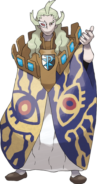
Finally, we got old man Ghetsis again. He has a cloak made out of Pride from FMA, that's pretty dope. And I think that's Sora's Keyblade? and Vegeta's Scouter? Why he looking like he's going to an anime convention and couldn't find a cosplay in time so he just threw on every piece of merch he owned? The cape is seriously bitching, but the rest I don't care for. At least it's better than his last gaudy outfit.
Ghetsis: 6/10
Amazingly, Plasma comes out BETTER in their renewed form. I think cutting away the faux-medieval theme was a smart choice, even if they're still lacking in cohesion. Oh, I forgot to mention the Shadow Triad, who showed up in both incarnations of the team, but were strangely underused and never really explained, nor do they have any official art. It's like they're shadows, lost to the world... but seriously, if Gamefreak cannot give enough of a crap to produce official art, then I won't give enough of a crap to review them. They were ninjas. That doesn't fit with anything else. Plasma is just a mess, okay? But at least Neo Plasma is a little fancier mess - like your cat threw up some caviar, instead of just kibble.
Overall: 3/10
Monday, November 30, 2015
Wednesday, October 14, 2015
Team Plasma of Unova
Remember when Gamefreak said that Black and White would have a better story than previous Pokemon games? I still laugh when I think back to those days.
Obviously, the thing that makes the most sense for a NYC-inspired region is a gang of radicalists who dress like knights. Aside from the random stitching on the hood, these are solid designs. Except, are they seriously supposed to be chainmail? If so, then cool! But why the hell are they wearing chainmail? If not, then that makes even less sense. I can understand not dressing like thugs, because they consider themselves "justice". But why knights? They didn't have a "Knights of the Round" theme going on at all, that could've been kinda cool. Anyway, my complaints are mainly about the appropriateness of the design, not the design itself. It's a decent look for low-level Paladin NPCs in some video game that isn't Pokemon.
Grunts: 8/10
There are no admins, just some old sages who don't really matter until BW2, so it's just Ghetsis running the show. And I think he's supposed to be dressed like a king, but holy shit why does he have an entire castle parapet on his shoulders? And what's with the gigantic eyes? and the scouter? Dude looks like he came straight outta Nausicaa. It's a weird, funky design, and feels "pagan" in a neat sort of way. I actually don't hate it, but I question it fitting in this environment. It also feels like it has very little to do with the Medieval theme that's been "established" - it's just too weird, for how by-the-book the Grunts are.
Ghetsis: 5/10
Then we have N, who really serves as your rival in this game. You also have Cheren and Bianca and Hilbert/Hilda running around, but since none of them are actually opposed to you at all, there's no tension. N conflicts with the player on an ideological level - you wanna catch 'em all, he wants to set 'em all free. The manner in which his ideology was just sort of hand-waved away, despite him being able to literally talk to Pokemon, was a main failing of the game's plot.
But let's talk design. He's cool! I'm saying this about everybody here, but they're all fairly alright designs - they just feel like they come from three completely different games, much less the same goddamn organization. Did N not get the memo? At least Ghetsis made some shit with paper-mache and stuff, N just walked out with his casual clothes on. I dig the style, big fan of Terry Bogard-style hats, light-green and monochrome make a cool visual look. but jesus what is he doing looking like this and being "the King" of Team Plasma. He looks confident but relaxed, and would have made a great proper Rival, maybe the best since Gary Oak.
n = x/10, when x = 9
So yeah, Team Plasma is stupid and couldn't decide on a theme. Why are they a "team" anyway, shouldn't they be a Cult? or a Kingdom? or an Order? And why "Plasma" of all things? None of it makes any sense. Their motivation seems promising at first, but then it's quickly revealed that N is maybe the only person in the entire group who genuinely believes in their cause. The rest are just going along with Ghetsis to steal Pokemon. And I still don't get N - he can talk to Pokemon, and heard from them about how awful people are, and how they want to be free, right? So why does all that get brushed under the rug? Just because you the Player are a good trainer, doesn't mean everybody else in the entire world is. Maybe there ARE some Pokemon who don't want to live and breed for the purpose of fighting. But the way the story goes, it paints N as just being flat-out wrong - Pokemon actually love this shit. It's like they called up Michael Vick's dogs at his trail as witnesses, and the dogs admitted they actually are totally into fighting each other.
I mean, for the sake of the series, the Player has to be the moral one. You can't admit that PETA was right all along. I just feel like, despite intended to introduce some morally grey subjects, the end result was very (wait for it) Black and White.
To wrap it up, "Team Plasma" fails at everything, from name, to organization, to goals, to cohesive costume design.
Overall: 1/10
Friday, October 2, 2015
Team Galactic of Sinnoh
I'm in no hurry, I hope you don't mind.
Sinnoh is my least favorite region, I think I've made that pretty clear by now, so I've put most of it from my mind. I remembered these guys being from space or something, but I had forgotten the bowl cuts. With that said, they actually look pretty solid. Definitely feels unisex like 60's sci-fi designs, complete with collar and aluminum hose arms. Logo displayed prominently, simplistic colors, yeah these work. Feel a little out-of-place as the uniforms for a human organization in what is close-to-modern day, but whatever.
Grunts: 9/10
The male admins at least continue the color scheme, and apparent "horrible hairstyles" executive mandate. But I dunno about the ribbing on their pants, and Saturn's arms. It worked for the grunts, because the silver suggests robot arms of something, and appeared to be skin-tight. But when you clearly have pants and a turtleneck on? Not feelin' it. Charon just looks disgusted to even be wearing his suit, though, which is probably why he's trying to cover up with a lab coat.
Saturn: 4/10
Charon: 5/10
Mars is looking good. Again, keeping up with the sci-fi motifs, with that Space Station 9 skirt. But Jupiter on the other hand... girl, did something eat part of your leg? What's up with that? You finna model Nina Williams' outfit in the next Tekken? It's just so distracting, two bands of flesh showing up like that. I do want to say that I love the name theme for Team Galactic, though now I can't help but think of Sailor Mars and Sailot Jupiter (best scouts) and now I'm sad that the whole team isn't dressed like that.
Mars: 8/10
Jupiter: 4/10
Goddamn Cyrus is rockin' that emo look. Baggy yet formless pants, straight-jacket looking thing on, and his face all like The Cure. Actually it's a pretty imposing glare, but that life-jacket he's got on, and those pants (which he also is wearing on his arms?) just makes him laughable. This is not what I would have expected from the boss of a kitschy sci-fi organization.
Cyrus: 3/10
I can't be assed to look up Team Galactic's motivations or goals, but as I recall they had some half-baked scheme about capturing legendary Pokemon to destroy the world. Which makes them as stupid as Magma and Aqua, but somehow less dumb, because at least they know they're gonna end the world. In any case, I've never found them particularly memorable, and honestly their outfits were better than I had remembered. Which isn't saying a whole lot.
Overall: 4/10
Friday, September 11, 2015
Team Aqua of New Hoenn
Let's check out Neo Aqua! They also got a redesign, and rebranding.
Well, they're certainly busier, that's for sure. Also looking rough, with those frayed shorts. Except they're wearing tights, and silly boots. Hey, don't those shoes look like the ones Neo Magma wears? Did they buy them at the same store? I like everything until you get below the end of the pants/shorts, I guess. Also - they're brown now! Either the whole team got a tan, or this Magma-vs-Aqua conflict has more racial tension than I previously assumed.
Grunts: 6/10
The admins are completely different. They're wearing what appears to be high-performance wetsuits, except Shelly has "fashionable" holes in hers, and Matt appears to have torn his. Dammit Matt, those things cost money! Also how the ever-loving shit did you get a reverse tan of the Aqua logo on your chest!? And what's happening around the edges of your hairline? Christ, Matt, you're a mess. Did you seriously pump so many steroids your chest and arms exploded out of your suit? I can still see it hanging on around your neck and hands there.
But Shelly, I'm not done with you. I miss the old red-head look, not gonna lie. This Empress Hancock style isn't working for me, nor is the random blue streaks. And at least Matt had the decency to put his logo on his chest, but yours is just lost in the design. If you're supposed to look like pirates, neither of you really succeeded.
Shelly: 2/10
Matt: 1/10
Now we come to the bossman himself, and he's wearing a golden anchor around his neck, like he's Flava Flav or something. And again, we see the confusion - high-tech wetsuit, but a weird frayed skirt-cape? And putting back on the bandanna, as if it's salvageable at this point. Man, this whole team redesign was a mistake.
Archie: 3/10
I like the basic idea here, I think - Magma becomes totalitarian and super-strict, almost Nazi-esque, while Aqua becomes wild and chaotic, like mercenary pirates. That works to differentiate the teams even more, but damn if the designs for Aqua did not pay off. Busy, confused, they're just ugly and only the grunts actually look piratical. Matt certainly looks "wild", but he also looks like he's lost his goddamn mind.
Overall: 2/10
Saturday, September 5, 2015
Team Aqua of Old Hoenn
Yeah, these are coming out slow. I'm in no rush, just kinda killing time until Gen 7 gets announced. Thanks for continuing to read, but I understand if you're done with this, too.
Anyway, it's Team Aqua! The other side of Hoenn's eco-terrorism boom.
I like this look a lot, you guys. Tight striped shirt immediately makes on think of sailors of Frenchmen. As is normal, the female grunt must show some skin. But then she gets to wear pants! That's pretty nice. These guys look mean and piratical, I love the bandannas and simple colors.
Grunts: 10/10
They have some admins as well, though in-game they look nearly identical to the grunts, similar to Magma. Similar as well, nobody cares about Matt, the male admin - but Shelly is surprisingly popular. And for good reason! She's basically Nami before the Timeskip even happened. I love her hair, you don't see much poofy curly hair in Pokemon, or Japanese games at all for that matter. And, she runs with the orange/blue color combo, getting it into her clothes as well. Yoithink of the New York Knicks, she got dat Mango Sentinel goin' on. Anyway, it's great - she looks like a modest Pirate Queen, definitely a rank higher than the grunts.
Shelly: 10/10
Their Boss, Archie, seems to be drawing a big page from Giovanni's wardrobe. What is it with the "wear a suit but no tie" fashion craze? I kinda like how he ain't even wearing a shirt underneath it, though - dude is ready to strip it all off at the drop of a hat. Aside from that, he's pretty boring though. Seen it before.
Archie: 6/10
These guys have a stupid goal, we've covered that. But I like the cut of their jib. The nautical theme works pretty well, even if their leader doesn't do much with it.
Overall: 8/10
Saturday, August 29, 2015
Team Magma of New Hoenn
Now let's take a look at Neo Magma, fresh from the Ruby/Sapphire remakes.
The first thing you'll notice is that they're wearing some sort of corduroy jumpsuits. Except the female uniform doesn't include leggings? that's stupid. They've also become just visually busier, and have taken up some stricter discipline. Now, this I don't mind - it gives the overall team some character, and especially sets it apart from the rowdy Neo Aqua guys. But now that they're no longer punks, their hoods look weird. You need some Hugo Boss-level uniforms to pull that shit off properly. Instead, these grunts look like they're wearing awkward snow suits.
Grunts: 3/10
The admins have also been revamped, and given more personality - which is also a good thing. But all the problems with the Grunts uniforms persist, and in face have gotten worse. The logos are just tiny label pins, you can't really see them. Yellow has been added for some reason, and Courtney appears to have some non-euclidean clothes going on with her vest there. Meanwhile, we got Tabitha (which ain't no name for a boy) who isn't even wearing his hood. What happened to the discipline!?
Courtney: 2/10
Tabitha: 3/10
Finally, Maxie. He's certainly looking like he values discipline and order, and I accept his label markings because the Big Boss ain't have to front as hard as his subordinates. But he still seems to be wearing a full-body sweater, and has cut-outs in his boots for absolutely no purpose I can imagine. And what's with those glasses, do they have frikken sideburns? Why??? Basically, he looks like a nerd and I hate him.
Maxie: 2/10
Yeah, the remakes really screwed Team Magma up. Again, I like the effort to make them feel like a different cultured organization compared to Aqua, but the designs really do not work with that. Or look good on their own.
Overall: 3/10
Friday, August 21, 2015
Team Magma of Old Hoenn
I'm going to treat teams Aqua and Magma differently between the originals and the remakes, because unlike Team Rocket, they took significant re-designs and rebrandings. With that said, here's Classic Magma.
Whereas Team Rocket looks like uniformed agents, Team Magma look like thugs. Hoodie, baggy pants, yeah I see that stereotyping in action. And they keep it simple - red and black. Logo on the chest as plain as day. The only difference between the gendered uniforms here is miniskirt vs awkward pants that end at the mid-calf.
Grunts: 9/10
Magma had two admins back in the day, but I can't find any decent art of the man. So instead here's the lady, who basically looks exactly the same as the female grunt, except she gots spiky horns and a longer skirt! With more rank, you can afford more fabric it seems. Not much to say here, it's still a solid design, but maybe you could flaunt your rank a bit more?
Courtney: 7/10
The leader of Team Magma is this dude. He doesn't dress like a punk, instead he's wearing one of those chinese-style suits that button down the side of the torso and up to the collar. It's simple and decent enough, except the cutoff between red and black just seems arbitrary. Why not wear an all-red top, with black pants? or maybe red torso, black sleeves? Yeah, just not feeling this one.
Maxie: 5/10
Their logo is simple, and looks like a mountain with maybe some lava boiling up underneath - very fitting. And it also kinda-sorta looks like an M? for Magma? eh? eh? Also, if you try really hard and believe deep down in your heart, you can pretend it looks like an Omega symbol. So the logo checks out on pretty much every front.
The problem, though, is that Team Magma's goals are mind-bogglingly shortsighted and lack justifications a 6-year old couldn't poke a hole in. Their plan is like something the Insane Clown Posse would come up with because they got water in their shoes one time, and in fact I think they DID drop a line that sums up both of these moronic teams - "What's with water? get more land / What's with deserts? get less sand."
I mean seriously. If you dry up all the oceans, then everybody dies. That's simple shit, people. You know what makes this planet so habitable compared to, say, Mars? FREAKING WATER. God, Maxie is stupid. And everyone IN the team is stupid to go along with his bullshit.
Overall: 7/10
Your logo and grunts are cool, but your leader and ideology - not so much.
Saturday, August 15, 2015
Team Rocket of Kanto (and Johto)
As has been requested, I'm gonna do some more design reviews of the Evil Teams. I'd say the main content of this blog is pretty much over until Gen 7 happens, so I don't blame anybody who just tunes out. If you do, please remember NAPACE when that day comes! I guarantee I'll still have steaming hot opinions about the Pokemon in it. But for now, let's talk Grunts.
The Rocket Grunts designs are just goddamn perfect. Seriously, they're friggin' works of art. Logo is simple and recognizable, and they look both practical and somewhat threatening. Also, as Jessie and James proved, swapping the colors around for black-gloves-on-white-uniform is just as neat. I have seriously nothing bad to say about these classy peeps.
Grunts: 10/10
Team Rocket seems to have two tiers of executives - those that just wear fancier versions of the usual grunt uniforms, and those who get the inverted white models. Proton and Petrel are of the former, and they're pretty cool I guess. Not sure why Proton has gloves that go up past his elbows, though. One criticism I would give is that the orange and yellow lines, while not offensive, seem to kind of go against Rocket's monochromatic stylings - everybody else only uses black, white, and that trademark Rocket Red. Still, rather sharp outfits. Petrel gets the edge because of his cool hair and "as if I give a crap" swagger.
Proton: 7/10
Petrel: 8/10
With the top-level executives, we're back to the basic colors, but inverted - to show that they run this shit. there's a fan theory that Ariana is the mother of Mars (of Team Plasma) and the Rival (of gold/silver), and while there's nothing going for it aside from hairstyles, I'm willing to entertain it. Having an absent mom who is a crime boss explains why your Rival is such a little pissant.
Anyway, these two look great. They sport their R's on little breast-patches, as does the Big Boss himself, and share his look of a suit-coat with no lapels or tie. It's an odd, minimalist choice that I really like. The only thing "wrong" here, is that Ariana has a diamond on her pelvis for no reason.
Ariana: 9/10
Archer: 10/10
As for Giovanni, we all know he's a badass. I docked him points as a Gym Leader for not reppin' his Element, but as the boss of Team Rocket he's amazing. Refer to my older review here, but also remember I was looking at him through a different lens then.
Giovanni: 10/10
Anyway, the team as a whole feels very cohesive, and is probably the best Evil Team in the entire series. They come back for a rematch in the second generation, and it's just great fun beating them down a second time. I appreciate how their motivation was just "make money", because that's what a mafia-style criminal organization does. If you commit crimes in the name of your ideals, you're probably a terroristor a politician.
Team Rocket Overall: 10/10
The Rocket Grunts designs are just goddamn perfect. Seriously, they're friggin' works of art. Logo is simple and recognizable, and they look both practical and somewhat threatening. Also, as Jessie and James proved, swapping the colors around for black-gloves-on-white-uniform is just as neat. I have seriously nothing bad to say about these classy peeps.
Grunts: 10/10
Team Rocket seems to have two tiers of executives - those that just wear fancier versions of the usual grunt uniforms, and those who get the inverted white models. Proton and Petrel are of the former, and they're pretty cool I guess. Not sure why Proton has gloves that go up past his elbows, though. One criticism I would give is that the orange and yellow lines, while not offensive, seem to kind of go against Rocket's monochromatic stylings - everybody else only uses black, white, and that trademark Rocket Red. Still, rather sharp outfits. Petrel gets the edge because of his cool hair and "as if I give a crap" swagger.
Proton: 7/10
Petrel: 8/10
With the top-level executives, we're back to the basic colors, but inverted - to show that they run this shit. there's a fan theory that Ariana is the mother of Mars (of Team Plasma) and the Rival (of gold/silver), and while there's nothing going for it aside from hairstyles, I'm willing to entertain it. Having an absent mom who is a crime boss explains why your Rival is such a little pissant.
Anyway, these two look great. They sport their R's on little breast-patches, as does the Big Boss himself, and share his look of a suit-coat with no lapels or tie. It's an odd, minimalist choice that I really like. The only thing "wrong" here, is that Ariana has a diamond on her pelvis for no reason.
Ariana: 9/10
Archer: 10/10
As for Giovanni, we all know he's a badass. I docked him points as a Gym Leader for not reppin' his Element, but as the boss of Team Rocket he's amazing. Refer to my older review here, but also remember I was looking at him through a different lens then.
Giovanni: 10/10
Anyway, the team as a whole feels very cohesive, and is probably the best Evil Team in the entire series. They come back for a rematch in the second generation, and it's just great fun beating them down a second time. I appreciate how their motivation was just "make money", because that's what a mafia-style criminal organization does. If you commit crimes in the name of your ideals, you're probably a terrorist
Team Rocket Overall: 10/10
Wednesday, July 29, 2015
The Worst 25 Pokemon of All Time
This is it. This is what this blog was founded on. Some Pokemon are really aces, you guys. They're cool or cute or badass or whatever!
Then you get some that are blights on the face of mankind. Specimens so awful, it's a wonder they were ever brought into the daylight. Horrific fusions of poor taste and misplaced design goals, I despite every single one of them with an unhealthy passion. But all that hate eats you up inside. And so, with this, I consider it case closed, I feel merely pity -
Sadly, not all Pokemon are created equal.
25. Barboach
24. Cherrim
23. Druddigon
22. Barbaracle
21. Phione
20. Smoochum
19. Rhyperior
18. Burmy
17. Garbodor
16. Kyurem
15. Mime Jr.
14. Cherubi
13. Staravia
12. Mothim
11. Azurill
10. Sigilyph
9. Wormadam
8. Drapion
7. Mega Manectric
6. Mega Aerodactyl
5. Tranquil
4. Uxie
3. Zygarde
2. Klefki
1. Dunsparce
Now, how about you? I'm sure you have a shit-list. Give me your bottom 10s!
Friday, July 24, 2015
My Top 25 Favorite Pokemon of All Time
As I was going through these individual type rankings, I realized my opinions of certain Pokemon had... shifted a bit, from when I wrote the review. I ranked them according to their written score, but sometimes I wished I had given this one a 10 instead of a 9, or that this guy wasn't really a 9, more like an 8, etc.
So, I figured I may as well do one last shout-out to all my Poke-homies. This will be a fresh ranking, from a fresh state of mind, that may or may not agree with my previous cumulative Top 10 lists, or reflect the exact score I gave each Pokemon.
Basically, it's my excuse to just say "screw it" to the past 5 years of data and give a completely emotion-based ranking off the top of my head, while everything is still fresh in my mind.
25. Gardevoir
24. Scizor
23. Magmar
22. Torterra
21. Deoxys
20. Scolipede
19. Gengar
18. Shiftry
17. Krookodile
16. Luxray
15. Kingler
14. Metagross
13. Cofagrigus
12. Typhlosion
11. Scyther
10. Blaziken
9. Donphan
8. Galvaltula
7. Pinsir
6. Starmie
5. Cacturne
4. Blastoise
3. Machamp
2. Heracross
1. Haunter
So, how about you? You don't have to rattle off all 25, but at least give me a top 10 all-time favorites.
Saturday, July 18, 2015
The Best (and Worst) Ghost-Type Pokemon
Saving the best for last, it's the ghosts with the most, my favorite type of all. They aren't many, but there amount of quality is super-high. And of course, it ends with my all-time reigning world champion favorite, Haunter, at the big #1 spot.
10. Mega Banette
9. Pumpkaboo
8. Chandelure
7. Aegislash
6. Sableye
5. Duskull
4. Shedinja
3. Gengar
2. Cofagrigus
1. Haunter
And like I said, there's just so few BAD ones. A bottom 5 is pretty much all I can do.
5. Gourgeist
4. Spiritomb
3. Drifloon
2. Doublade
1. Dusknoir
10. Mega Banette
9. Pumpkaboo
8. Chandelure
7. Aegislash
6. Sableye
5. Duskull
4. Shedinja
3. Gengar
2. Cofagrigus
1. Haunter
And like I said, there's just so few BAD ones. A bottom 5 is pretty much all I can do.
5. Gourgeist
4. Spiritomb
3. Drifloon
2. Doublade
1. Dusknoir
Friday, July 17, 2015
The Best (and Worst) Dark-Type Pokemon
Dark, as a sub-type, is like butter. It makes everything better. I didn't think I would consider it one of my favorite types, and I don't particularly like the Dark elements of it, but it just seems that the sort of Pokemon that gets ascribed a Dark sub-type, just has enough of that edge to be really badass and cool.
10. Krookodile
9. Pangoro
8. Tyranitar
7. Houndour
6. Sableye
5. Weavile
4. Sharpedo
3. Shiftry
2. Sneasel
1. Cacturne
In fact, there's just not that many bad Dark types. I stopped the list at 8, because any more and I'd be dipping into 5/10s and I just don't think that score belongs on a bottom anything.
8. Bisharp
7. Mega Tyranitar
6. Mega Gyarados
5. Spiritomb
4. Mightyena
3. Scraggy
2. Skuntank
1. Drapion
Tuesday, July 14, 2015
The Best (and Worst) Psychic-Types
I'm back! And on the predicted date, too. It's almost as if someone saw the future? someone... with Psychic Powers? (no? no good?) okay sheesh give me a break it's tough trying to come up with puns for every type.
Here's my top 10 psychic Pokemon, a fair amount of them are Legendaries. In fact, some of the few legendaries you'll see on my top 10s.
10. Claydol
9. Victini
8. Mew
7. Gardevoir
6. Abra
5. Reuniclus
4. Deoxys
3. Mewtwo
2. Metagross
1. Starmie
But what is with the Psychic type to produce these inbred rejects. You think they're a decent sort, coming out with Mewtwo and Abra and the like, but then all of a sudden there's Jynx and Wobbuffet, and then each of them get even worse prevolutions! Just goes to show, I guess.
10. Wobbuffet
9. Bronzor
8. Jynx
7. Wynaut
6. Mespirit
5. Smoochum
4. Mega Slowbro
3. Mime Jr.
2. Sigilyph
1. Uxie
Thursday, July 2, 2015
Announcing a break, for once
It seems kinda silly to do this, since I've displayed the ability to vanish for nearly a month at a time without a warning, but this time I know ahead of time I'm gonna be gone, so yeah.
NAPACE will be back on the 14th. see you in two weeks, people.
And you can hold me to that. Ain't no way I'm gonna quit now, when I still have some of my favorite types left to cover.
NAPACE will be back on the 14th. see you in two weeks, people.
And you can hold me to that. Ain't no way I'm gonna quit now, when I still have some of my favorite types left to cover.
Wednesday, July 1, 2015
The Best (and Worst) Steel-Type
You know, I think somehow I'd forgotten how many Steel-types there are. In my head it's not an oft-used type, but there's really a lot of them these days. And a lot of kickass Pokemon with balls of steel, too.
10. Lucario
9. Escavalier
8. Mega Scizor
7. Genesect
6. Mega Mawile
5. Steelix
4. Aegislash
3. Aggron
2. Scizor
1. Metagross
And surprisingly few crap ones! I mean, those bottom two are absolutely vile, but most of this list are 3/10s. That ain't bad. Makes me think that Steel actually has a great average rating.
10. Klang
9. Magnezone
8. Mega Steelix
7. Doublade
6. Mega Lucario
5. Shieldon
4. Magneton
3. Bronzor
2. Klingklang
1. Klefki
Monday, June 29, 2015
The Best (and Worst) Fairy-Type Pokemon
Okay, Fairy is officially my most hated type. I don't really like it on a concept level, and while I appreciate how it was used to give boring Normal-types something different, it also seemed to be assigned to the worst of them all. And in fact, it's hard to think of many good ones. So here's a top 5, but I'm already reaching by the time we hit the cinco.
5. Whimsicott
4. Jigglypuff
3. Mega Audino
2. Mega Mawile
1. Gardevoir
On the other hand, it's very easy to think of hateable ones! These Pokemon suck majorly! I don't like them at all! I think I've made myself abundantly clear!
10. Carbink
9. Togetic
8. Cleffa
7. Clefable
6. Snubbul
5. Dedenne
4. Igglybuff
3. Mime Jr.
2. Azurill
1. Klefki
Saturday, June 27, 2015
The Best (and Worst) Bug-Types
I love Bug-types. I think it's something about how bug-catching is the closest to real-life Pokemon collecting you can get, or maybe just that bugs have badass plates and jaws and horns and spikes and stuff. This was a pleasure to look through, and honestly I feel like numbers 2 through 7 could really go in any order, I love 'em all so much.
10. Genesect
9. Shedinja
8. Mega Beedrill
7. Joltik
6. Scizor
5. Scolipede
4. Pinsir
3. Scyther
2. Galvantula
1. Heracross
But by some cruel trick of fate, there are also a large number of stupid, pointless and ugly Bug-types. Kind of like real life, I suppose. But it seems like I'm generally hot or cold on these guys, either I think they're pretty great, or I can't reach for my flyswatter fast enough. Special points for the bottom three for just being the single WORST evolutionary line ever, not a single redeeming feature about any of its members.
10. Mega Pinsir
9. Scatterbug
8. Crustle
7. Nincada
6. Cascoon
5. Dustox
4. Illumise
3. Burmy
2. Mothim
1. Wormadam
Thursday, June 25, 2015
The Best (and Worst) Dragon-Types
Dragon is such a weird type. It doesn't have any obvious elemental connections, and exists mainly as a mechanic to make some Pokemon "better" than others. This is especially obvious in the first few gens, where it was almost exclusively the purveyance of the psuedo-legendaries.
10. Gabite
9. Altaria
8. Tyrantrum
7. Zekrom
6. Giratina
5. Dratini
4. Gible
3. Haxorus
2. Dragonair
1. Rayquaza
But really, it turns out I don't like Dragon-types that much. Maybe it's because the games treat them like they're hot shit, but really a lot of them are just over-designed actual shits. Oh, and no, I will NOT apologize for hating Mega Ampharos. It's really really really stupid.
10. Mega Latias/Latios
9. Bagon
8. Shelgon
7. Mega Ampharos
6. Reshiram
5. Dragonite
4. Druddigon
3. Mega Salamence
2. Kyurem
1. Zygarde
Sunday, June 21, 2015
The Best (and Worst) Poison Types
I get to give props to my all-time favorite Pokemon today, so that's always cool! Haunter, you're my bae. Forever and always. The rest of you are cool, too, I guess.
10. Muk
9. Nidorina
8. Nidorino
7. Roserade
6. Nidoking
5. Beedrill
4. Mega Beedrill
3. Gengar
2. Scolipede
1. Haunter
I'd forgotten how aggressively ugly some of these Pokemon were. Poison, as a type, tends towards the ugly, but that doesn't mean I have to like it. The bottom two in particular are just such a mess, I don't even know.
10. Skrelp
9. Skuntank
8. Gloom
7. Dustox
6. Tentacool
5. Trubbish
4. Seviper
3. Gulpin
2. Drapion
1. Garbodor
Wednesday, June 17, 2015
The Best (and Worst) Ice-Types
It's hotter and sweatier than Elvis Presley's armpit where I live, so what better way to cool down than with some chill Ice-Types? I notice that this top 10 is bookended with Pokemon I accuse of looking like those infamous Little Ponies, and I'm not entirely sure I like what that says about me.
10. Lapras
9. Cloyster
8. Mega Abomasnow
7. Walrein
6. Snowver
5. Glalie
4. Weavile
3. Sneasel
2. Abomasnow
1. Aurorus
There aren't that many Ice Types to begin with, and so these are literally all of the "bad" ones. Kyurem is really, really freaking bad, though. Like amazingly awful. Stupendously sucky. Wonderfully whack. But I digress...
10. Delibird
9. Cryogonal
8. Mamoswine
7. Beartic
6. Spheal
5. Mega Glalie
4. Snorunt
3. Jynx
2. Smoochum
1. Kyurem
Saturday, June 13, 2015
The Best (and Worst) Flying-Types
NAPACE has been accused of a strong anti-avian bias, and I'm here to say that those rumors are 99% true. There are a few birds I approve of, but most of my favorite Flying-types are the non-feathered variety.
10. Xatu
9. Gligar
8. Vespiqueen
7. Hawlucha
6. Talonflame
5. Gyarados
4. Tropius
3. Rayquaza
2. Braviary
1. Scyther
You know, in a way I'm grateful for all these shitty Normal/Flying types. They're almost always terrible, and give me an excuse to really lay into them. And angry writing is fun writing. So I guess I'll say this - Thank you, Staravia. Thank you for existing, so that I might hate you.
Oh, and like with the Normal-types, I just used one from each evolutionary line, or else the list would just be basic bitch birds. Gotta have room for the other whackjobs to get their shellacking, too.
10. Mega Pinsir
9. Pidgey
8. Mega Salamence
7. Swellow
6. Sigilyph
5. Togetic
4. Mothim
3. Mega Aerodactyl
2. Tranquil
1. Staravia
Friday, June 12, 2015
The Best (and Worst) Ground-Types
As I did this blog, I discovered that I actually rather liked Ground-types. I've never counted them among my favorites before, but dang there are quite a few really great ones. They're like Rock-types, except better.
10. Gible
9. Trapinch
8. Sandslash
7. Hippowdon
6. Steelix
5. Quagsire
4. Diglett
3. Nidoking
2. Torterra
1. Donphan
But, they also crap out some shits once in a while. Most of them fall into the "ugly and pathetic blob" category. Special shoutouts to Rhyperior, Barboach, Whiscash, Palpitoad, and Stunfisk for appearing in multiple bottom 10s. Thankfully, as triple-types haven't been invented (yet) that's the last we'll be seeing of them.
10. Landorus
9. Mamoswine
8. Vibrava
7. Nincada
6. Stunfisk
5. Palpitoad
4. Whiscash
3. Barboach
2. Rhyperior
1. Zygarde
Thursday, June 4, 2015
The Best (and Worst) Fighting-Types
Next to loving, I like fighting best. and next to Bug-Type, I like Fighting-Type best.
So it should come as no surprise to see all these beloved favorites. Which show I think an interesting mix between face-melting badasses, and cool-but-cute 1st stage dudes. And I especially love it when, in the case of Machop, the latter grows up into the former.
10. Mankey
9. Pancham
8. Lucario
7. Pangoro
6. Timburr
5. Machop
4. Blaziken
3. Hitmonlee
2. Heracross
1. Machamp
Such was not the case for poor Conkeldurr, who is basically looking back at his elementary school yearbook and thinking "what happened. I used to be such a cutie... where did it all go wrong...?"
But surprisingly, not a single 1/10 to be seen here. Still enough baddies to fill out the list, though. But most of them could totally work, with a few design tweaks.
10. Mienshao
9. Meditite
8. Gallade
7. Keldeo
6. Scraggy
5. Gurrdurr
4. Mega Heracross
3. Pignite
2. Chesnaught
1. Conkeldurr
Sunday, May 31, 2015
The Best (and Worst) Rock-Types
Would it be cliche to say "let's rock and roll!"? What if I said that these pokemon ROCK? Or said we're off to a rocky start? Or what if I drank a glass of eggs then jogged to the top of a stadium? Okay okay, I'll stop.
Let's do Rock Types. A full 50% of this list are Fossils, which are really only Rock as a formality. Turns out I don't much care for the "imma lumpy bumpy piece of rock!" Pokemon.
10. Amaura
9. Magcargo
8. Tyrantrum
7. Regirock
6. Kabuto
5. Kabutops
4. Tyranitar
3. Aggron
2. Gigalith
1. Aurorus
On the other hand, I don't really hate them that much either. The ones that got the worst scores were just offensively ugly, and again had little to do with being "rocky".
10. Diancie
9. Golem
8. Tirtouga
7. Crustle
6. Carbink
5. Bonsly
4. Rhyperior
3. Binacle
2. Barbaracle
1. Mega Aerodactyl
Friday, May 29, 2015
The Best (and Worst) Electric-Types
Now with fancy-pants links, so you can go and check out to see if I'm lying or not!
There aren't many Electric types, but there are plenty of great ones. It was kinda hard to put the top three of this one in order, actually. I love Galvantula and Luxray for being cool and badass, but Joltik is just the cutest thing this side of Chii's Sweet Home. In the end I gave it to Galvotron for having the coolest name.
10. Ampharos
9. Heliolisk
8. Mareep
7. Chinchou
6. Pikachu
5. Elekid
4. Raikou
3. Joltik
2. Luxray
1. Galvantula
You'll notice that about half of this bunch of dim bulbs are just Pikachu knockoffs, like those cheap Chinese shit you find in the Dollar Store. That ain't a He-Man action figure, it only has two points of articulation and he has a gun instead of a sword. And the package says "Legendy Hero's". Where am I going with this? I don't know.
Thunderus is bringing up the rear because while his normal form is awful, his other form is somewhat better. He still averaged out to be bad, of course.
10. Thunderus
9. Magnezone
8. Pichu
7. Magneton
6. Plusle
5. Mega Ampharos
4. Minun
3. Stunfisk
2. Dedenne
1. Mega Manectric
Thursday, May 28, 2015
The Best (and Worst) Water-Types
There are a ton of Water Pokemon. And one of the biggest failings of the Hoenn region was being full of water, but only filling it with Wingull and Tentacool. If I'd been able to meet these fly homies, I wouldn't have overdosed on repel so much. It's also kinda interesting to go back and see what grades I gave things, I'm surprised that the Gen 1 dudes aren't all higher, but I guess I came into it with the right mindset from the start. If I'd done it in reverse order, you can be sure I'd have inflated all their scores. Squirtle only got 7/10 and he's like my absolute bro, for crying out loud.
Well, I guess he isn't, or else I'd have rated him better. But as a top 10, I really like the look of this.
10. Kaputops
9. Chinchou
8. Gyarados
7. Wooper
6. Poliwhirl
5. Sharpedo
4. Quagsire
3. Kingler
2. Blastoise
1. Starmie
On the flip side, we dive deep and pick up a bunch of crap that should be thrown back in. It starts with the ugly sacks of shit, but then gets deeper and darker with just plain boring and pointless bland fish. The kind that you gotta slather with Tartar sauce to get any kind of flavor. And it reaches the Marianas Trench of Crappy Water-Types with Phione. Bleghch.
10. Alomamola
9. Palpitoad
8. Huntail
7. Mega Slowbro
6. Barbaracle
5. Whiscash
4. Barboach
3. Finneon
2. Feebass
1. Phione
Tuesday, May 26, 2015
The Best (and Worst) Fire-Types
Now this was a pleasure and a pain at the same time. For being one of the cornerstone typings, there's not actually that many Fire Pokemon. And yet there's so many excellent ones. I felt like the owner of the inn in the nativity story, my rooms are so booked with AAA-list celebs that I can't even spare a queen-size for the Son of God himself.
10. Rapidash
9. Houndour
8. Darmanitan
7. Torkoal
6. Entei
5. Magmar
4. Charizard
3. Typhlosion
2. Chandelure
1. Blaziken
And on the flip side, there's not even that many bad ones! So few, in fact, that I felt like I would be reaching into honestly decent Pokemon if I did a full bottom 10. So here's the bottom 5 instead. Reshiram takes home the prize for being the only 1/10 irredeemable turd of the Fire family, while the rest smolder along close behind.
5. Delphox
4. Magmortar
3. Tepig
2. Chimchar
1. Reshiram
Sunday, May 24, 2015
The Best (and Worst) Grass-Types
I don't think of myself as a big fan of Grass-types, but this top 10 is almost entirely 10/10s. Though again, it's almost entirely dual types, so expect some of these guys to appear again later.
10. Oddish
9. Pumpkaboo
8. Tropius
7. Roserade
6. Shiftry
5. Abomasnow
4. Chikorita
3. Simisage
2. Torterra
1. Cacturne
As for the worthless weeds, it turns out that starting your name with a "ch" is a really good way to get on my shitlist. I don't feel as much hate for these as I do some other Pokemon, it's more like intense apathy. Would the world even notice of Cherubi and Cherrim were wiped from existence?
No. No it would not.
10. Gloom
9. Chesnaught
8. Petilil
7. Paras
6. Skiploom
5. Sceptile
4. Parasect
3. Cherrim
2. Chespin
1. Cherubi
Friday, May 22, 2015
The Best (and Worst) Normal-Types
Finally! It's here! The older posts are fully cataloged for easy searching. Which means I can begin the endgame, starting with Normal types.
First off, let me come right out with it - I don't like Normal types. I don't see the point in using a whitebread Pokemon that can't even get Super-Effectives on anyone. Sure, it has STAB Normal moves, but Normal moves are boring af. I'm playing magical digimon rock paper scissors, dammit, I wanna throw some fire or thunder or something.
With that said, my top 10 Normal Types are as follows:
10. Porygon
9. Slaking
8. Snorlax
7. Heliolisk
6. Delcatty
5. Exploud
4. Mega Kangaskhan
3. Skitty
2. Braviary
1. Arceus
However, it's worth noting that out of these, only the top 4 were 10/10s. I'm sure that for some types, the list will be almost all 10's. But we start having to reach into 9s and 8s pretty soon, when you're talking about Normies. And I'm aware that Arceus can be any type, which makes him at the top kind of ironic - part of the reason I think he's so great is that he can freaking stop being Normal-type.
As for a bottom, 10, oooh baby, will this be hard. Because there's just so many to choose from.
10. Pidgey
9. Purugly
8. Ambipom
7. Linoone
6. Happiny
5. Bidoof
4. Staraptor
3. Unfezant
2. Azurill
1. Dunsparce
Really, was there ever any doubt? The King of Crap himself reigns supreme at the bottom of every list I can think up. Also, I decided to just let Staraptor and Unfeazant speak for their entire lines, because otherwise I could have filled an entire bottom 10 with normal/flying catastrophes. Also interesting to note - Pidgey, the original "this Pokemon sucks wow", is just hanging on there at 10. It kinda shows what kind of putrid pukes have come out since, that Pidgey doesn't look all that bad now, does it?
haha just kidding Pidgey is still freaking awful
Friday, May 15, 2015
In case you were worried...
I'm not dead, or stopped. It's just that my computer finally crapped out on me and I had to take the poor girl out behind the shed and cap her like Old Yeller.
NAPACE isn't finished, I still want to get around to revisiting some... controversial ratings, talking about Fairy Type, doing a "best of " for each type, etc. I'm also going back and making sure the images are still linked properly, and adding in the type tags, because most of the 4th and 3rd gens are missing them.
So yeah, bear with me for a bit, okay? Kinda sucks to lose the momentum like this, coming off of the most-viewed month NAPACE has ever had, but whatever. It's not like I make money off this thing, I just do it for you guys.
Sunday, May 3, 2015
Mega Evolution no. 46: Audino
Would you like to make a contract?
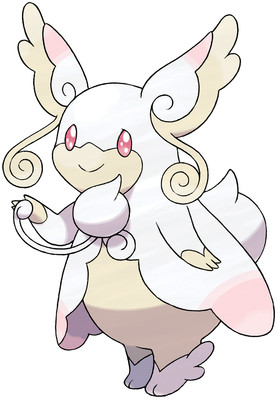
Awww, look! It's got a little stethoscope! And a cute lil' labcoat! And cute lil' booties!
Mega Audino is almost too cute, for real. It's one of those Megas where I wish it could just be the regular evolution. But also isn't it pretty freaking stupid that they had to give a Mega to something from the 6th gen? like, you couldn't make it good enough already? It's like the most convoluted balance patch ever.
But yeah, I like it. Mega Audino really runs with the "doctor" theme, much more than Blissey or Chansey ever did, who just remained big fluffy eggs. Audio is fluffy and egg-shaped, but as you can see, it has curly tendrils and ears and shit, so obviously it is superior.
Overall: 8/10
Saturday, May 2, 2015
Mega Evolution no. 45: Gallade
As any parent knows, you can't give one child a Mega Evolution without their sibling also demanding one.
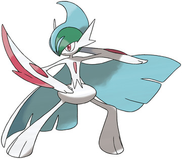
I think this could be called an improvement. It still has the awkward Amazing World of Gumball hips, an a blue crest for no reason (why not red?), but at least it looks cooler.
Actually making the arm blades out of the red blades that have been established by all previous forms was a good move. And the crest looks more Kinnikuman-esque, so that's neat. Also I dig the split cape, which echoes the style of the feet, and reminds me of Mega Gardevoir's dress flaps.
what's up with the chest gem shrinking, tho? Does that signify anything? What are those things supposed to be, anyway, does the Pokedex ever mention it? I suppose I could look this up, but that sounds too much like work.
Overall: 7/10
Tuesday, April 28, 2015
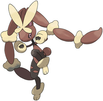
Mega Evolution no. 44: Lopunny
goddamit Gamefreak you know exactly what you're doing, don't you
Of course Gardevoir and Lopunny were gonna get mega evos. I should have guessed.
But while Gardevoir was pretty alright, Lopunny is just a trainwreck of a Pokemon, from head to toe, not a single thing goes right here. What jumps out at me first, is the bizarre intersection of arms and neck at the top of its torso, looking like the kind of anatomy 2nd graders draw. That head is going to snap that neck, and the stick-thin arms look ridiculous compared to the generous thighs.
Oh, and let's talk about those thighs - Lopunny appears to be wearing stockings with "sexy" rips in them! Wonderful! Also it stuck its arms in a pair of giant packing peanuts, but that's another issue.
Wait no, let's also talk about the giant-ass butterfly just on the front of its head like it's trying to teach Kate Winslet how to fly. Or maybe we could talk about how stupid it is that its ears have multiple scrunchies on them, further contributing the image of a sepia-tone 80's jazzercise bunny.
Overall: 1/10
Sunday, April 26, 2015
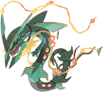
Mega Evolution no. 43: Rayquaza
going to ride a bicycle made of nightmares straight up your ass
Rayquaza is one of my favorite legendaries, he's badass as hell. Mega Rayquaza coul have been even cooler, but he screws the pooch in a major way - those tendrils.
They look out of place and completely ruin the silhouette. And they aren't even nice thin curves, one of 'em has hoops in it, and is otherwise smooth, while the top ones are crackly and jaggedy! Show some consistency! And get rid of the crap on the end of your tail, too.
Because with that gone, it's just a Rayquaza with Dragonballs embedded in his side, and a mean-ass mandible piece for cutting down entire forests or something. And then the Seven-Pronged-Sword marking on his eye is badass as well.
A pity I can barely make out all that, thanks to the neon tentacles flapping around all over the place like a 15-year-old at a Nightcore rave.
Overall: 6/10
Friday, April 24, 2015
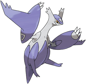
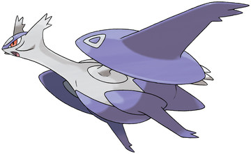
Mega Evolution no. 42: Latias/Latios
they look so goddamn like the same person, I would say to them "you want ice cream cone", they would both say yes
Yeah, I can't tell these wonky funks apart, so I'm doing them both at the same time. Red and Blue both go to Purple, makes sense to me.
Anyway, this is another Mega form for a Legendary, which I just disagree with on principle. Legendaries are already overpowered, do they need to get more overpowered-er? Gamefreak thinks so.
The design has some good points, the arms becoming full pods and all. But I think they still ought to have proper wings on their backs, instead of trailing under-side wing-legs danglers. And is it just me, or is the color combination, combined with the way they look like they're wearing diapers, remind you of Mewtwo?
Overall: 3/10
Monday, April 20, 2015
Mega Evolution no. 41: Metagross
I don't know why I expected anything else from Mega Metagross
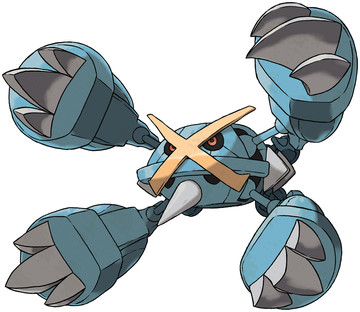
Beldum was a single arm. Metang is two of those arms on a body. Metagross is two Metangs stuck together. So, logically, Mega Metagross is two Metagross stuck together, length-wise.
That's right - it's hard to tell from this picture, but he has FOUR MORE ARMS on the back end there. They aren't quite as large, but still. It's ridiculous, but again - could it have been anything else? It's this kind of insane yet consistent logic that I can't help but love. I wish Magnezone has used it, and been a cluster of Magnemite all together, instead of just one dumb flying saucer mofo.
Oh, and Mega Metagross also gets some gold plating on his X and a chin-spike, so he can swag all over everything. As well as ram you like a Trireme. As if he didn't already have enough ways to destroy faces.
I like the idea here, but I'm taking off a point because I'm not sure it's executed quite as well as it could have been. Why not an 8-legged spider monster?
Overall: 9/10
Saturday, April 18, 2015
Mega Evolution no. 40: Salamence
they said I could become anything I wanted. So I became a frisbee.
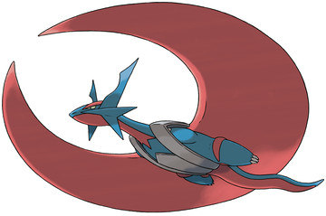
What the greater hell is happening here, exactly. Salamence has always been kinda doofy, but he just kicked it up a notch. His wings are now just a big-ol crescent shape, which by all accounts shouldn't be able to move, which means he has to glide everywhere.
Which is kind of a step down, isn't it? his lil' backpack harness straps there aren't helping this illusion, he looks like he just strapped in for some ziplining. Oh, and I thought he cut off his arms at first, but it turns out he just tucked them in like his hands were cold and he's sticking them under his shirt into his armpits, like we've all done.
But in any case, Mega Salamence looks stupid. Going from a dragon with the power of free flight, to some sort of armless lizard strapped to a moon disc, is not my idea of an upgrade.
Overall: 1/10
Tuesday, April 14, 2015
Mega Evolution no. 39: Glalie
I don't know how they managed to make Glalie even more terrifying, but they did
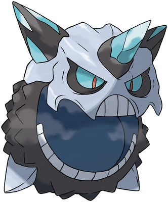
Because the only thing more terrifying than a pissed-off ball of ice wearing Jason Voorhees' mask is a pissed-off ball of ice wearing Jason Voorhees' mask with a neckbeard.
Except he's still not Dark/Ice, what the heck. Dude is unhinging his jaw in order to swallow a small child whole, and has dirty slush all up in his ice bits, how is he not deserving of a Dark subtype? Actually, scratch that - this nightmare is 7 feel in diameter, which means he could eat a goddamn normal adult without much problem. Jesus Christers.
Look, Glalie is cool, but Mega Glalie is just something else. I don't care for the neckbeard, and black/cyan is an ugly color combination. He just scares me, and I want him to go away.
Overall: 2spooky/10
Subscribe to:
Posts (Atom)